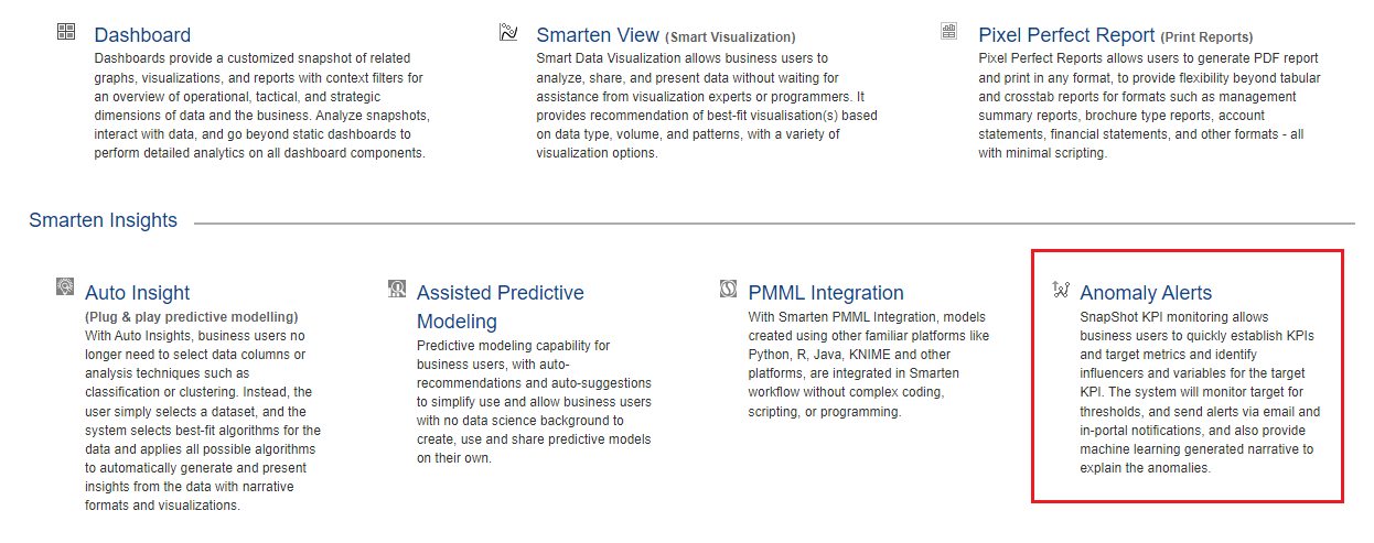
1. Introduction
Smarten Cloud solution is the perfect approach for businesses with a limited budget and a tight schedule. This all-in-one approach to analytics enables traditional business intelligence with self-serve dashboards, reporting and data visualization, as well as advanced analytics with a suite of natural language processing (NLP) search capabilities and Smart Data Visualization, Self-Serve Data Preparation, Assisted Predictive Modeling, Anomaly Alerts and other tools. Smarten Cloud provides a foundation for a self-serve, Citizen Data Scientist environment and requires no SQL or data science expertise. This accessible solution provides integrated reporting, dashboards and predictive modeling insights – all in one place, and all at your fingertips, to create data pipelines, reports and predictive models within minutes.
Here are the quick getting started steps you can follow to create BI objects and predictive models in just five minutes.
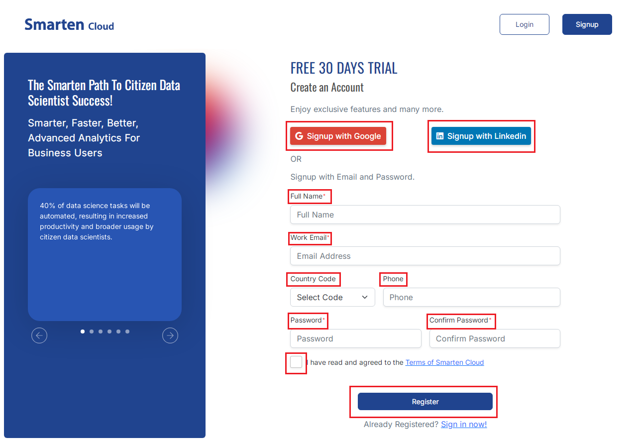
2. Signup for Smarten Cloud
- You can register on Smarten Cloud platform by clicking given below “Signup” link on Smarten Cloud.
- Signup for 30 days free trial by filling the required information on the registration form. Click “REGISTER”.
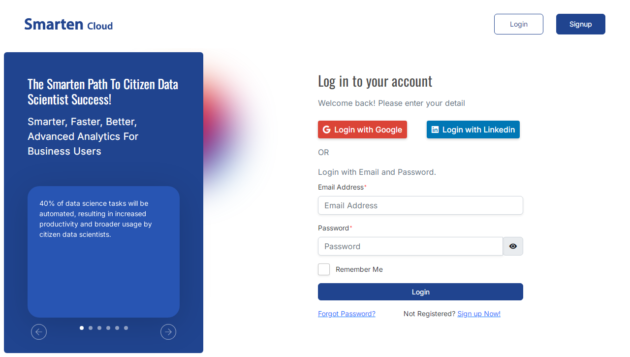
- Once registered, you will receive a mail with verification link. Once verified, you will receive the welcome mail with two data files - SalesData.csv and Employee.csv.
- Login to Smarten Cloud platform with the email id and the password using below URL.
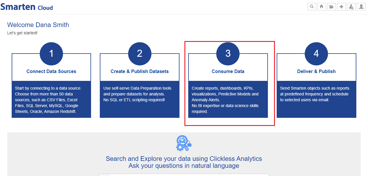
3. Overview of the Process
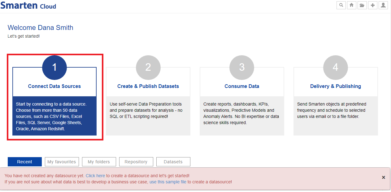
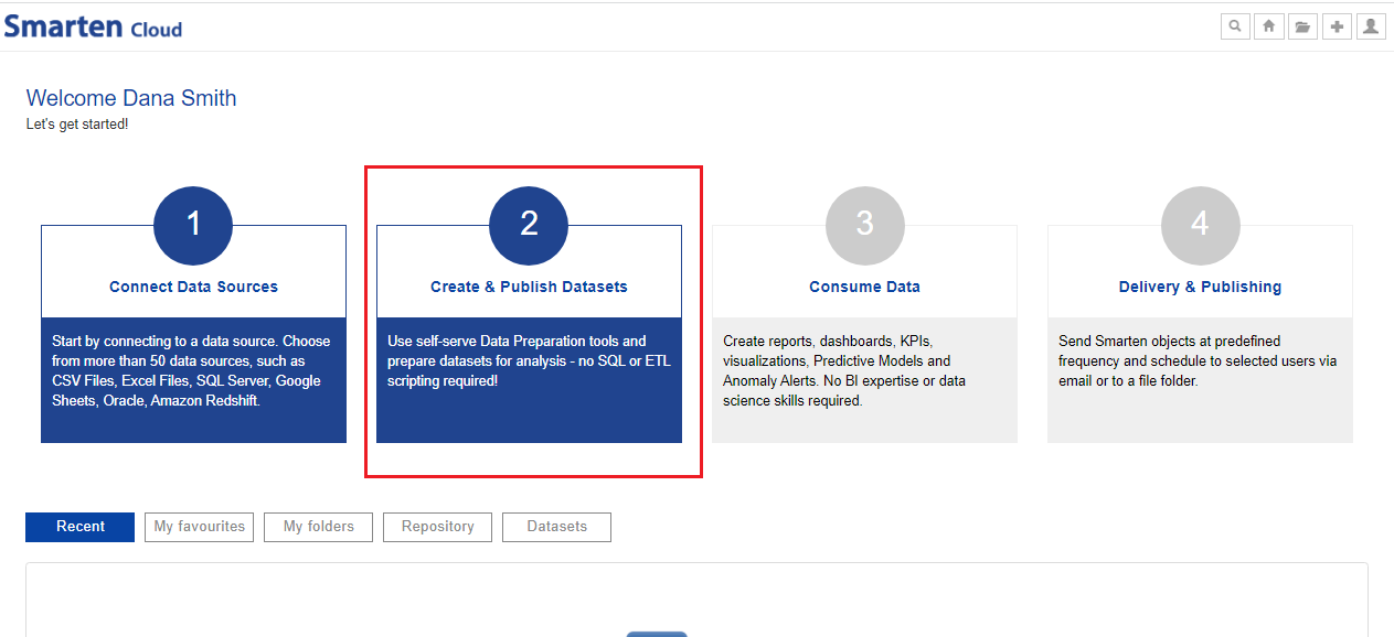
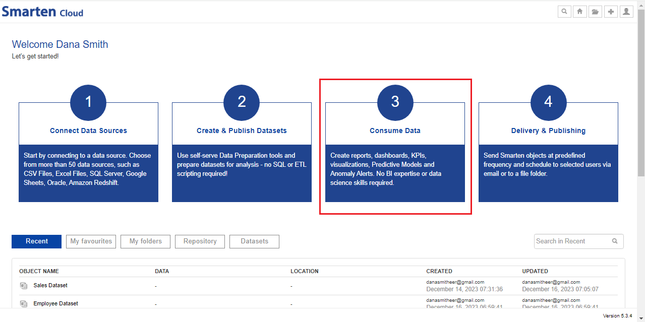
After you have registered and logged into Smarten Cloud platform, you can proceed in the following way.
- Connect to Data sources: You can create data sources from more than 50 data sources such as CSV files, Excel files, SQL server, Google Sheets, Oracle, Amazon Redshift and others.
- Create and Publish Datasets: You can use self-serve Data preparation tools, create and publish datasets.
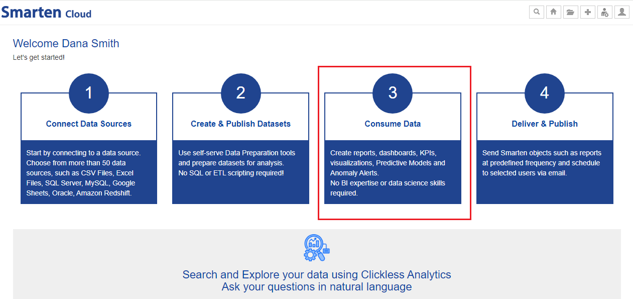
- Consume Data: You can use the datasets to create reports, dashboards, KPIs, Visualizations, Predictive models and Anomaly Alerts.
- Search Data: You can search using natural query on your datasets and get best-fit visualization and answers, like Google search.
- Deliver and Publish Smarten Objects: You can send the Smarten objects at predefined frequency and schedule to selected users via email or to a file folder.
4. Create a Data Source
You will need the sample data files to get started.
Download the SalesData.csv and Employee.csv files from welcome email sent to you during registration process or download files from below URLs. URL: http://app.smarten.com/csv/SalesData.csv and http://app.smarten.com/csv/Employee.csv
Click the option “Connect Data Sources” from the home page and proceed to create data source. We will first create data source using SalesData.csv file.
CONNECT DATA SOURCES
- Select the option for Data source type as “File>Text” and click “Next”.
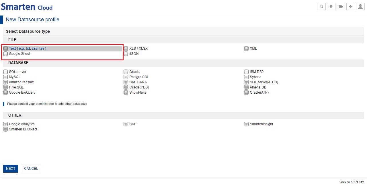
SELECT DATA SOURCE TYPE
Give the name of the Data source, upload the downloaded data file “SalesData.csv” and click “Next”.
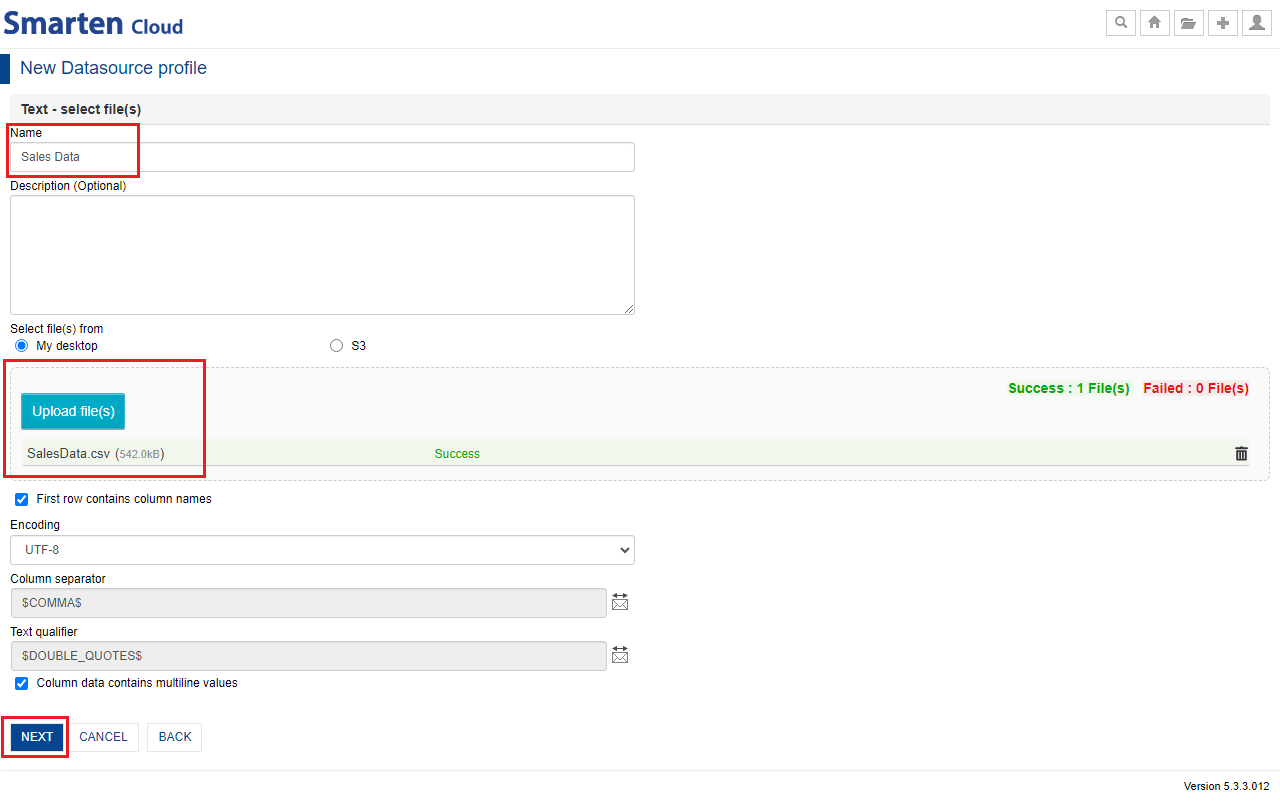
CREATE A DATA SOURCE
Once data from the data file is validated, the system will auto-detect the data types of each column and shows column data type selection screen. You can change the data type of the any column which is recommended by the system, and click “Save”. You can preview the sample data extracted from uploaded file.
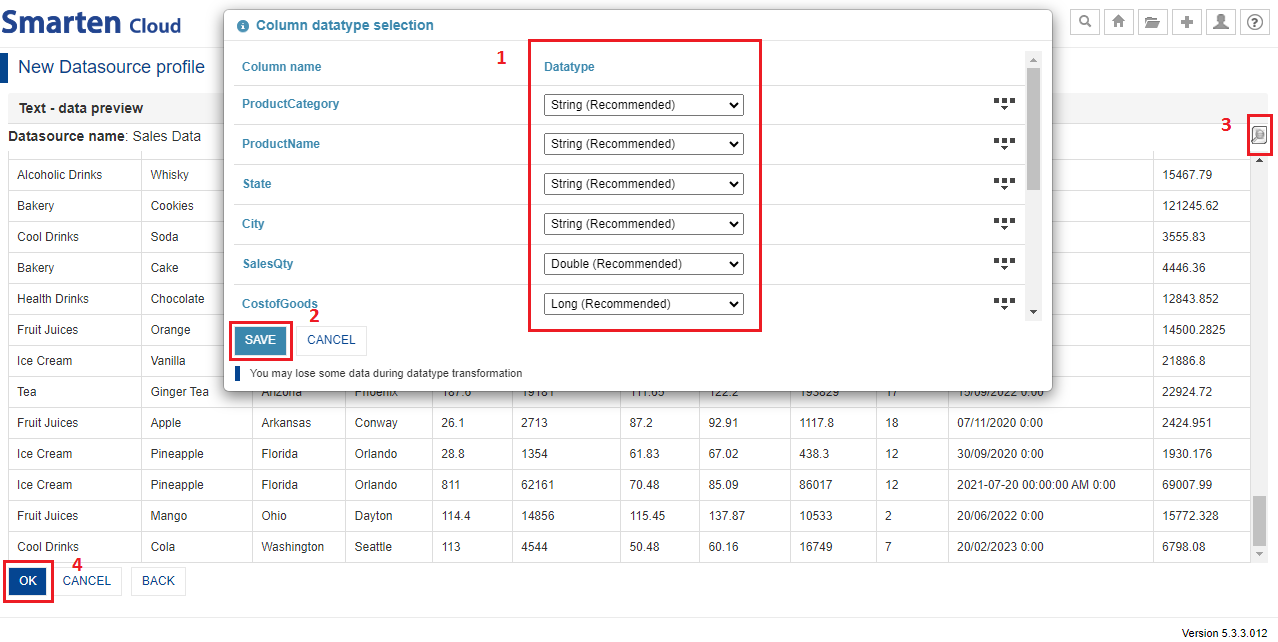
DATA SOURCE PREVIEW
You can reopen the data type selection dialogue by clicking the “Column data type selection” icon.
Click “OK.” The data source is now saved and ready to use.
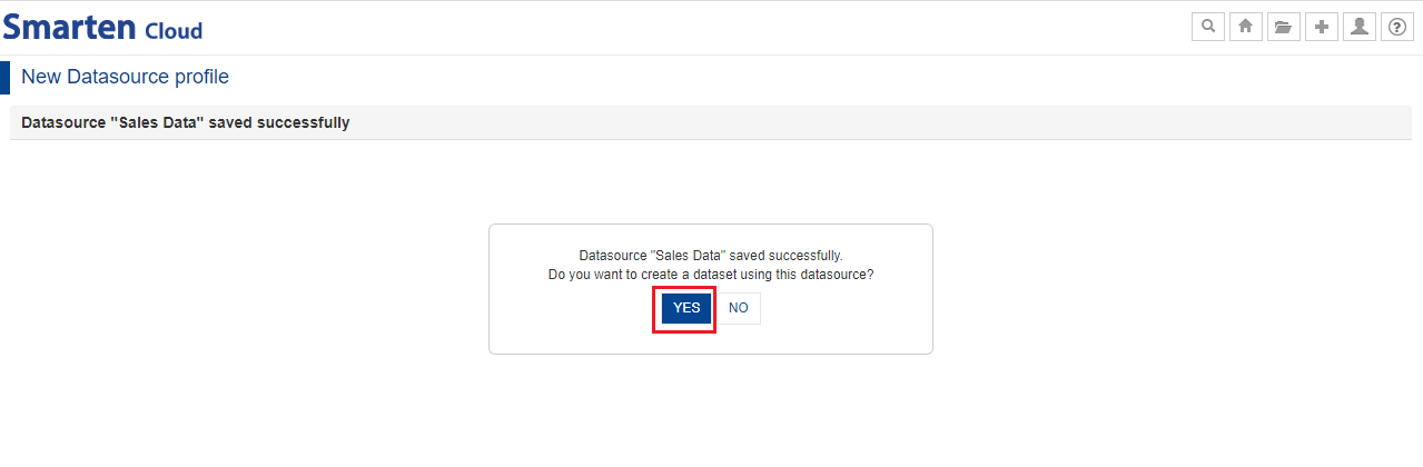
Once the data source is created, you can proceed to create dataset by clicking “Yes”. You can also create a new dataset by clicking the option “Create and Publish Datasets” from the home page.
- After creating SalesData data source, you can also create Employee data source using Employee.csv file using the same procedure as above.
5. Create a Dataset
This section will explain how to create dataset from “Sales Data” data source which you created above.
Click the option “Create & Publish Datasets” from the home page and proceed to create a dataset.
CREATE & PUBLISH DATASETS
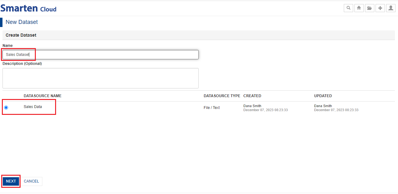
- Select the data source profile “Sales Data” from the list.
- Give the name of the dataset “Sales Dataset” and click “Next.”
CREATE A DATASET
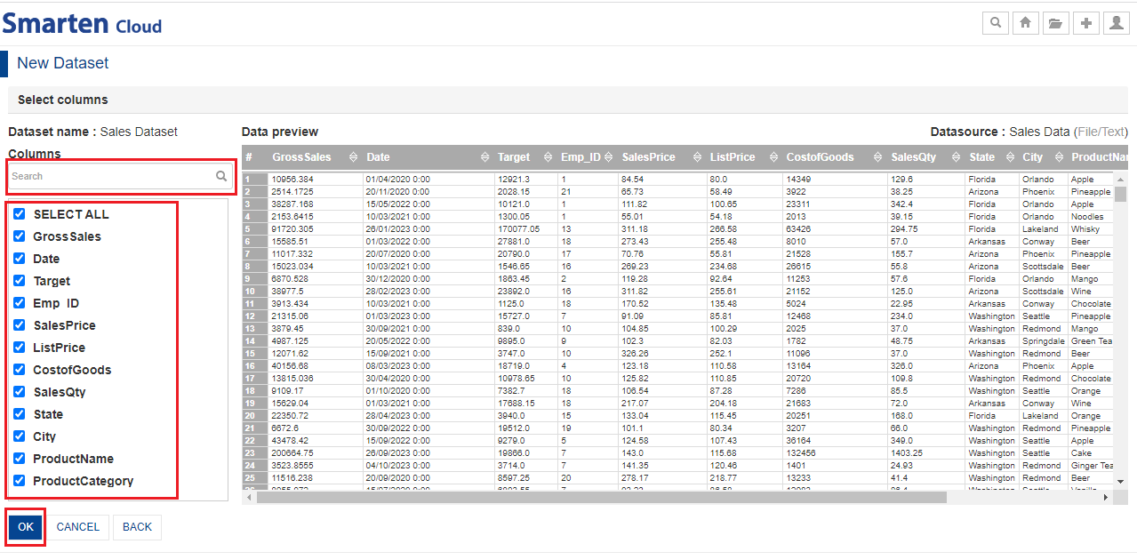
- You can select columns from the list provided in Columns section. By default, all columns are selected. Data preview shows the preview of the columns that are selected for creating the dataset. Click “OK” after selecting the columns.
DATASET-DATA PREVIIEW
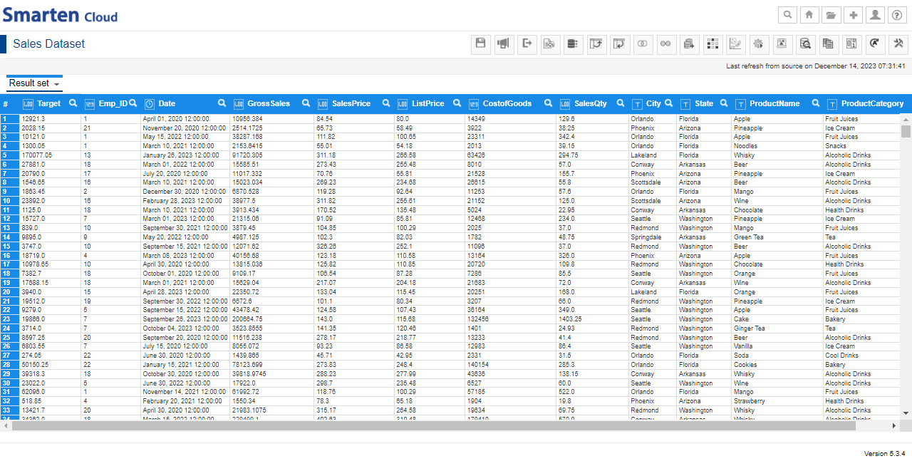
- The dataset “Sales Dataset” is created and now, ready to use.
NEW DATASET
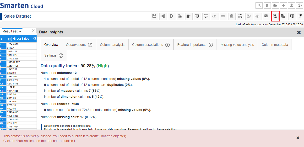
- You can get the data quality score of the dataset and other data insights, such as Missing value analysis, Column analysis, Outliers, Column associations, Feature importance, and more. You can reopen the Data Insights window by clicking the “Data Insights” icon from the tool bar.
DATASET-DATA QUALITY INDEX
- Similarly, you can create a new dataset by using “Employee Data” data source. Give the name “Employee Dataset”.
5.1 Blend-JOIN datasets
- After creating both datasets, now let us join “Employee dataset” data with “Sales dataset” data. Open the “Sales Dataset”. Click on “Add Dataset(s)” icon. Check the box against “Employee Dataset” to add the dataset and click “OK”.
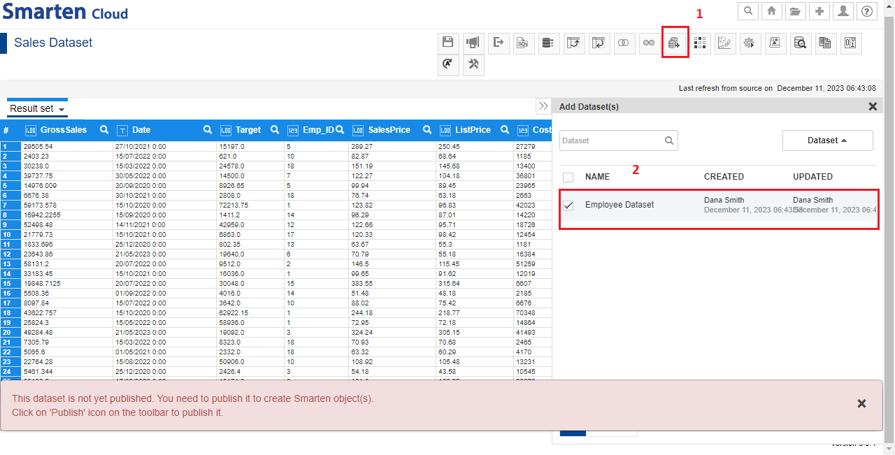
ADD DATASET(S)
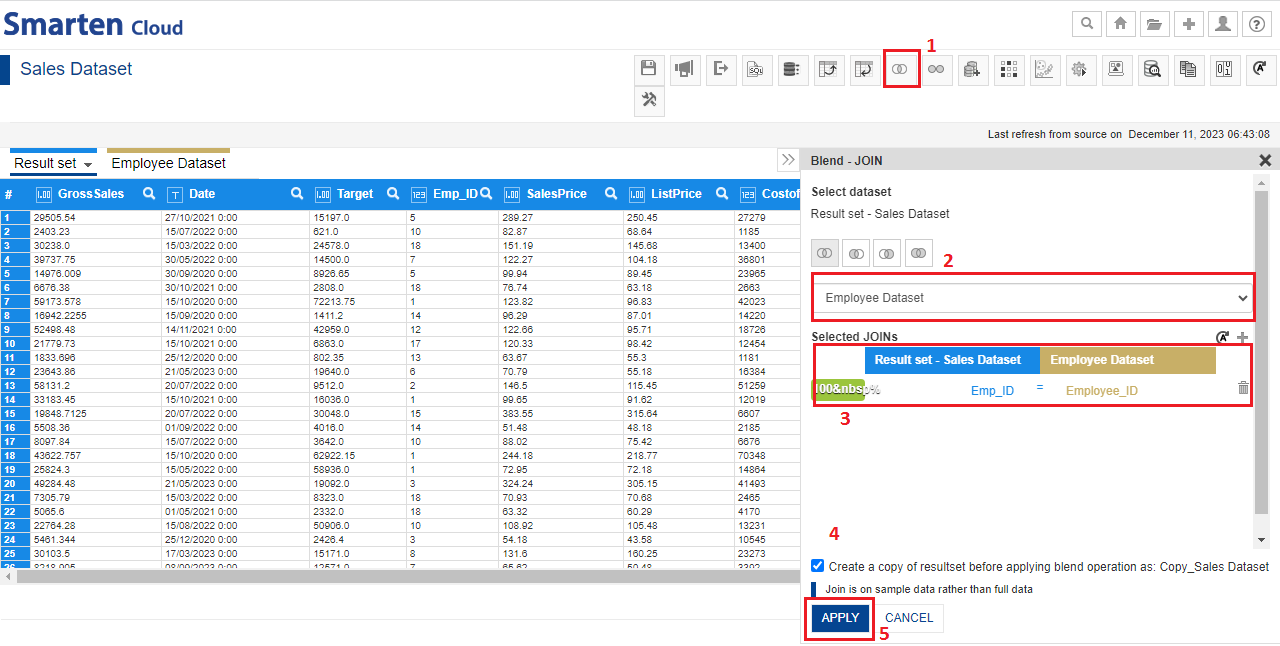
- You will see the “Employee Dataset” tab, next to “Result set” tab which implies you have added the dataset.
- You can join the two datasets by clicking “Blend-JOIN” icon. Select “Employee Dataset” from the dataset list.
- System will automatically identify and select appropriate JOIN conditions for selected dataset. As shown below, system will select JOIN condition between “Emp_ID” of Sales dataset and “Employee_ID” of the Employee dataset. This condition has 100% matching values in both the datasets. Click “APPLY” to join datasets.
BLEND-JOIN DATASETS
- System will perform JOIN action and will display the data in “Resultset” tab as shown below. Employee dataset columns are shown in different color.
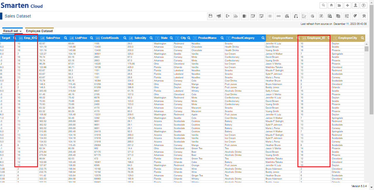
JOIN DATASETS-COMMON VALUES
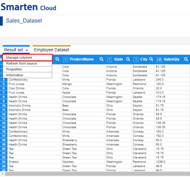
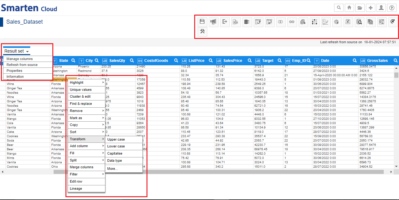
5.2 Manage Dataset Columns
- You can manage dataset columns and perform operations such as remove or rename columns. Click on “Result set” tab and click “Manage Columns”.
DATASET – MANAGE COLUMNS
- For the current dataset, after performing Blend-Join operation, employee id columns are repeated in the dataset. Thus, we can remove one of these columns; let’s select “Employee_ID” and click the “Delete” icon to delete the column. Click “APPLY” for this change.
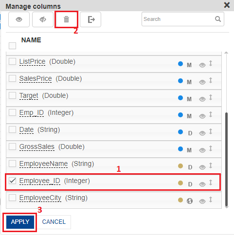
DATASET- DELETE COLUMN
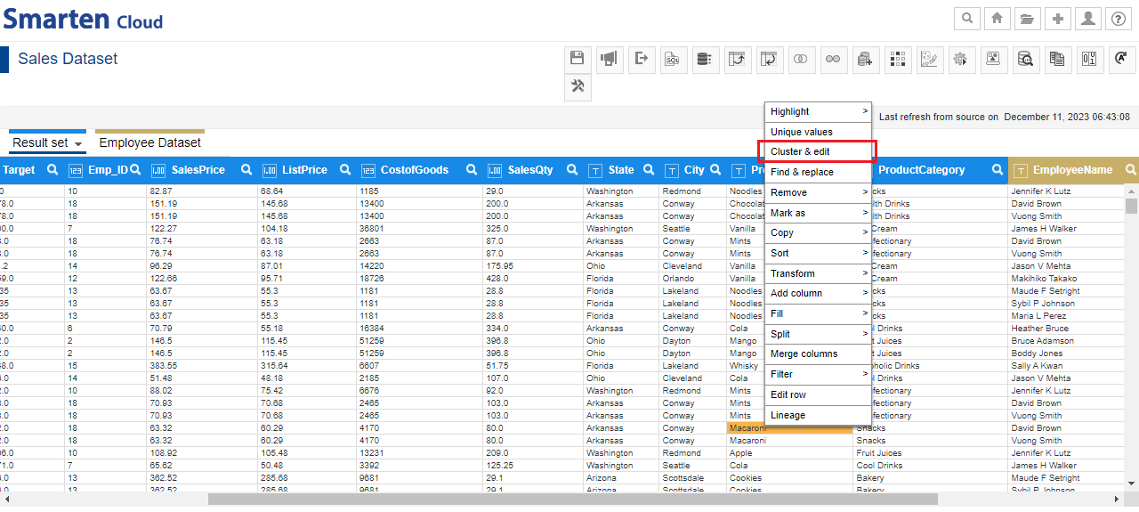
5.3 Clean Data
- You can do cleaning operations using “Cluster and edit” and “Unique Values” options for the given columns. Right-click on the “ProductName” column and select “Cluster and edit” from the list of options.
SELECT CLUSTER AND EDIT
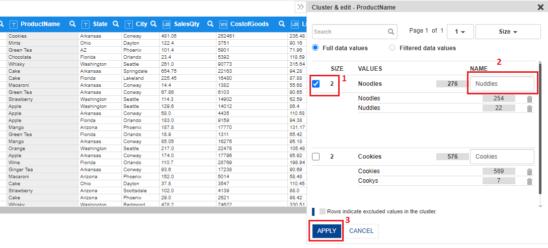
- In the “ProductName” column, system identified 2 clusters for “Noodles” and “Cookies” with different spellings. To correct this inconsistency, select the box against the value cluster and enter the correct value in the text box under “Name” column. Click “APPLY” to edit cluster values with correct value.
CLUSTER AND EDIT OPERATION
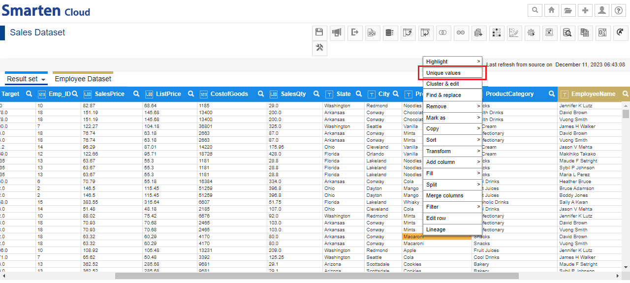
- Similarly, you can use “Unique values” option. Right-click on “State” column and select “Unique values” option.
SELECT UNIQUE VALUES
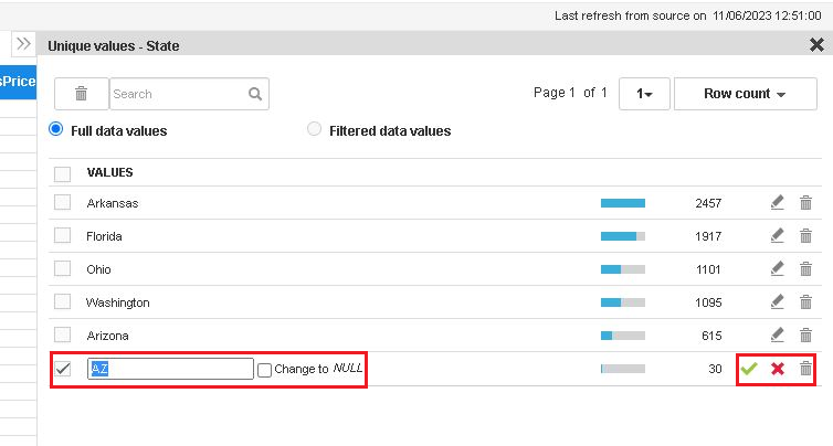
- You will see all the unique values of State column with record count statistics. If you look at list of values, one value (AZ) is in short form while other values are full State names. You can edit the value to “Arizona” by clicking on edit icon along with it.
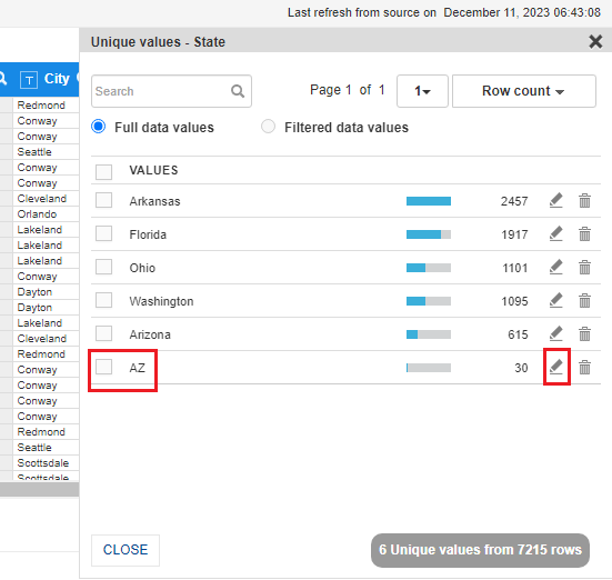
UNIQUE VALUE-EDIT
- System will update the new value in the State column. You can save, cancel or delete the value as per requirement.
UNIQUE VALUES
5.4 Transform Data Types
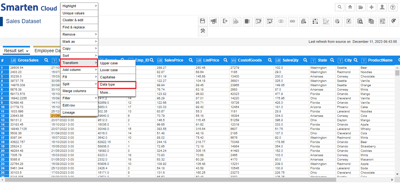
- You can transform data type of any column of the dataset. For this dataset, “Date” column data type is STRING. Let’s transform its data type to TIMESTAMP. Right-click on the “Date” column and select “Transform >Data Type” from the list of options.
TRANSFORM DATE-DATA TYPE
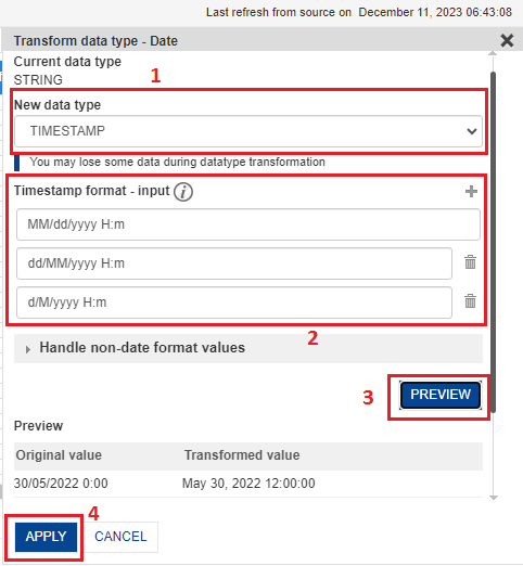
- System shows the current data type as “STRING”. Let’s select “TIMESTAMP” from the “New data type” drop-down list. System analyzes data of “Date” column and automatically identifies date formats in the data and shows under “Transform format-input” section. You can add or modify the date formats. Click “PREVIEW” to get the preview of the data. Click “APPLY” to transform “Date” column data type.
TRANSFORM DATE-TIMESTAMP
5.5 Add Column
- Once “date” column is transformed into TIMESTAMP, let’s create columns for Year, Quarter and Month from the “Date” column. Right-Click on the “Date” column and select “Add Column>> Year” option.
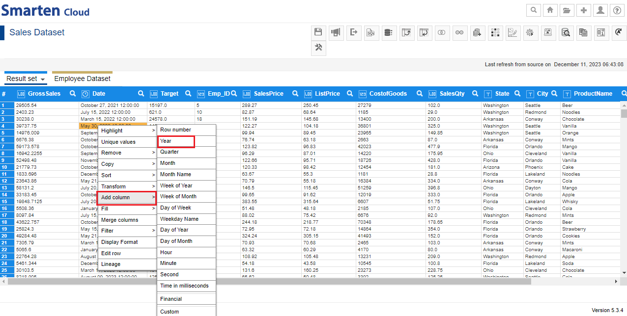
DATE-ADD COLUMN-YEAR
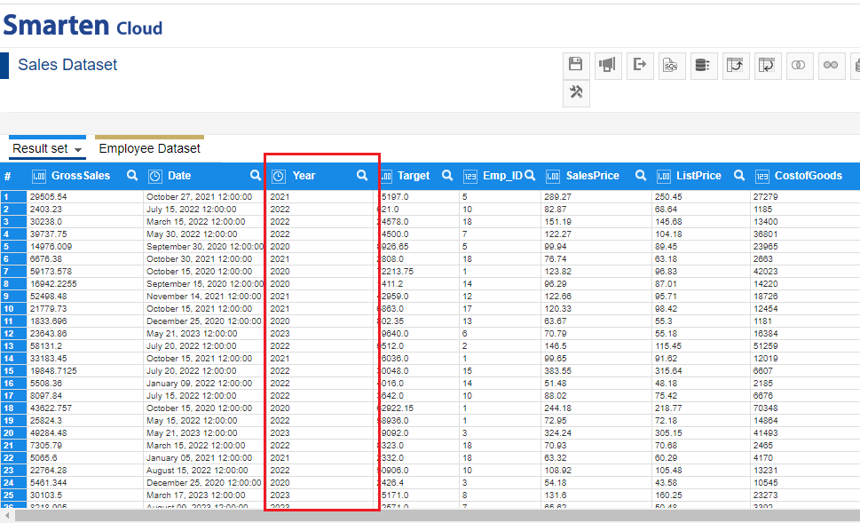
- The system will create “Year” column next to the “Date” column. Similarly, you can create “Quarter” and “Month”.
DATE-CREATE YEAR COLUMN
5.6 Action Editor
- If you want to track the steps performed on the dataset, click the “Action Editor” icon from the tool bar. You can select and inactivate or edit or delete any step as per requirement. You can also rearrange the sequence of steps in the Action editor.
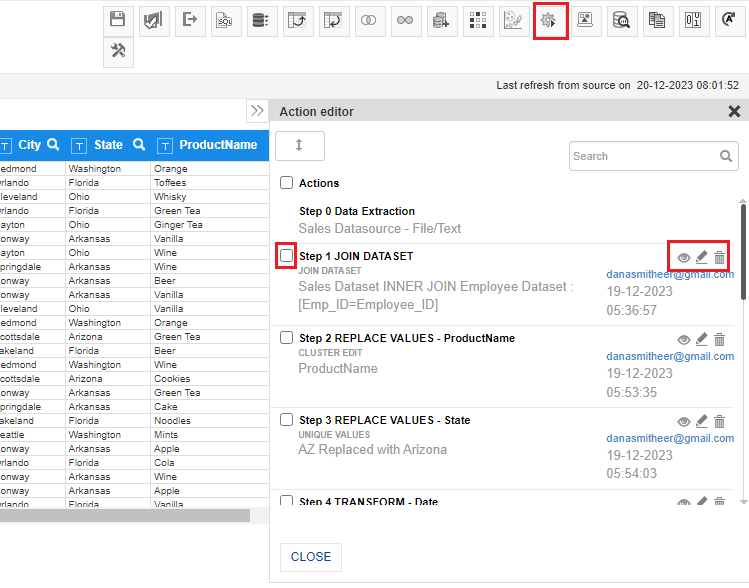
ACTION EDITOR
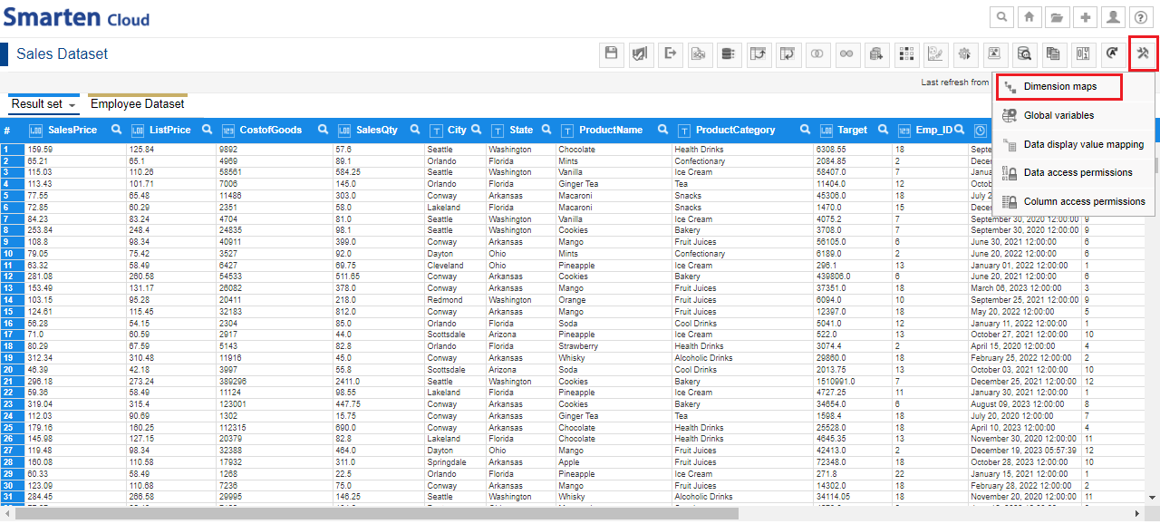
5.7 Dimension Map
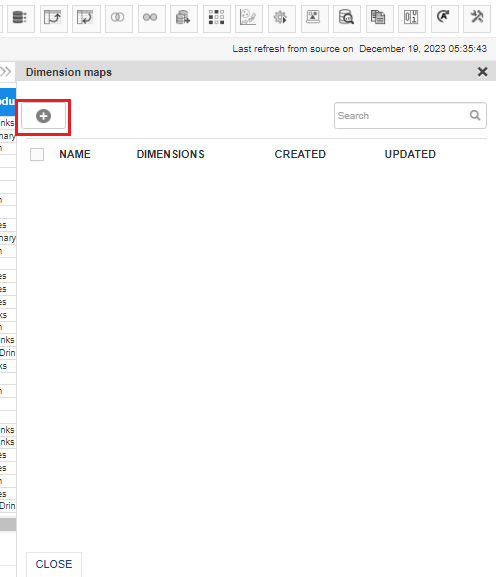
Now, let’s create Dimension Map which enables “Drill down” feat-ure in BI objects such as Crosstab, Graph, Geomap, and SmartenView. Click “Tools” icon from the tool bar and select “Dimension Maps”.
- Click “ADD” icon to create a new dimension map.
DIMENSION MAP-ADD
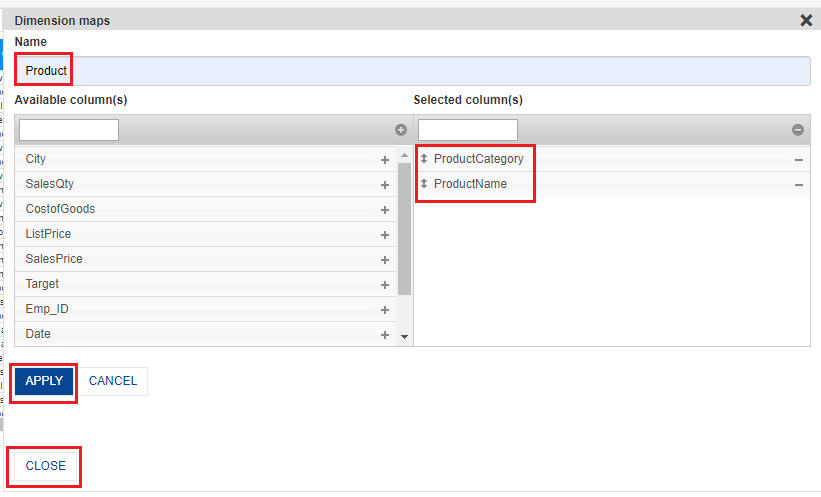
- Let’s create “Product” dimension map. Select “ProductCategory” and “ProductName” columns and Click “APPLY”.
DIMENSION MAP – ADD PRODUCT
- Similarly, you can create Dimension maps for “Time Period” to include “Year”, “Quarter” and “Month”; “Region” to include “State” and “City”.
5.8 Publish Dataset
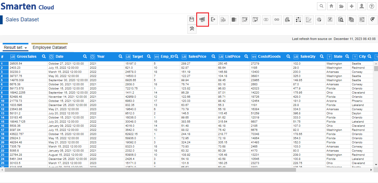
Now, you need to publish the dataset to create BI objects from this dataset. Click the “Publish” icon in the tool bar.
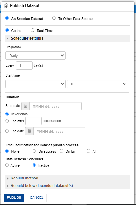
- You can publish a dataset as a Smarten dataset or you can also publish dataset data on other data sources. You can publish Smarten data as cache data or real-time dataset. If you choose to publish as a Cache dataset, it allows you to create a Scheduler that can be configured to update the dataset data as per predefined frequency and duration automatically.
PUBLISH DATASET
- In “Publish Dataset” dialog, keep all default options selected and click “Publish” to publish the dataset. Also, click the “Save” and “Publish” icons every time you make any change in the dataset.
- Rebuild dataset enables you to update dataset with the latest data from the data source. You can update the dataset with entire data - From scratch or append only the new data available in the data source - Incremental.
- You can also select “Refresh from source” option in the “Result set” tab if you need to update the dataset with the changes made in its data source.
PUBLISH DATASET DIALOG
Note:Scheduler Settings are provided with paid subscriptions only.
Real-Time datasets are available only in Premium subscription.
5.9 Menus and Navigation in Self-Serve Data Prep
You can perform various operations from the tool bar, result set menu, and context menu.
- Toolbar menu: Save Publish, Export, SQL query, Aggregate, Pivot data, Unpivot data, Blend-JOIN, Blend-Append, Add Dataset(s), Sampling, Outlier, Action Editor, Tools and others.
- Result set menu: Manage columns, Refresh from source, Properties, and Information.
- Context menu: Unique Values, Cluster and edit, Find & Replace, Filter, Fill, Sort, Transform, Split, and others.
DATASET-MENU BARS
6. Create a Crosstab
This section will explain how to create Crosstab object from “Sales Dataset” dataset which you created above.
- *Click the option “Consume Data” from the home page.

CONSUME DATA
- Click on “Crosstab” to create a new Crosstab object.
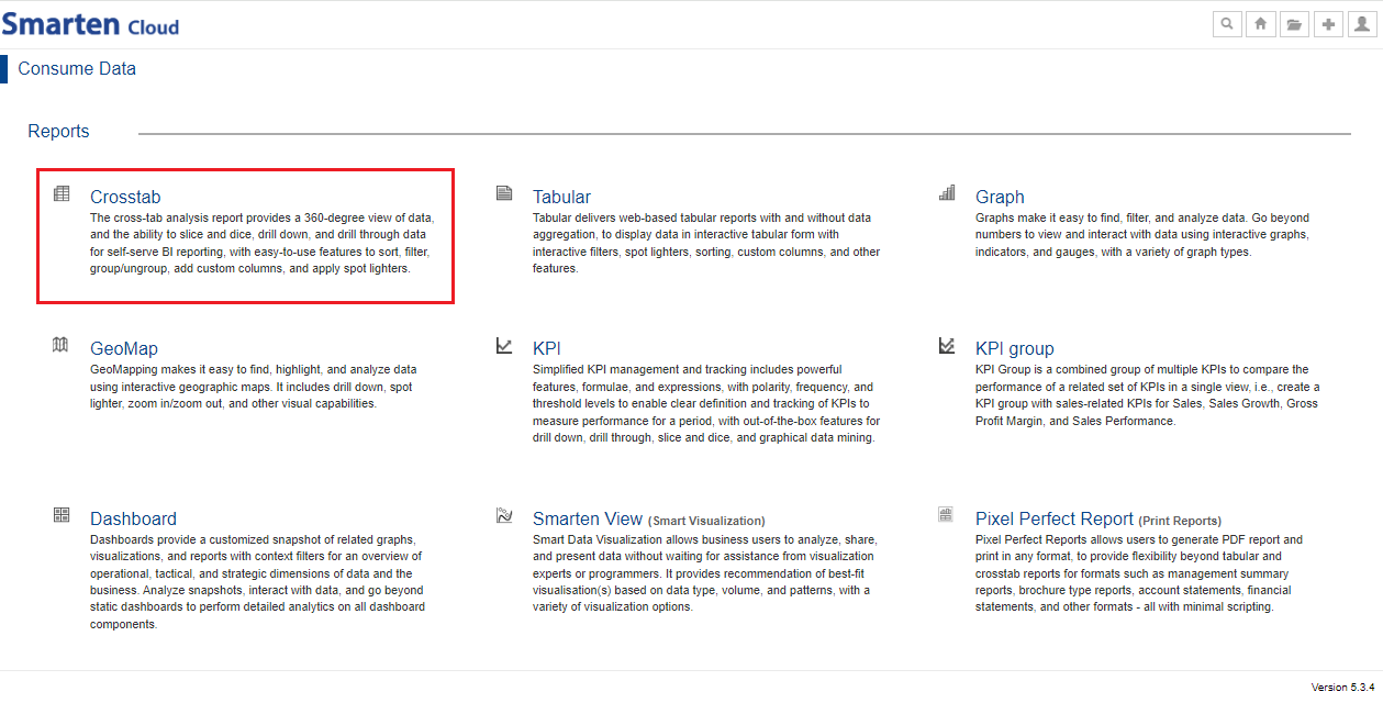
CROSSTAB
- Select the dataset “Sales Dataset” to create a Crosstab. Click “NEXT”.
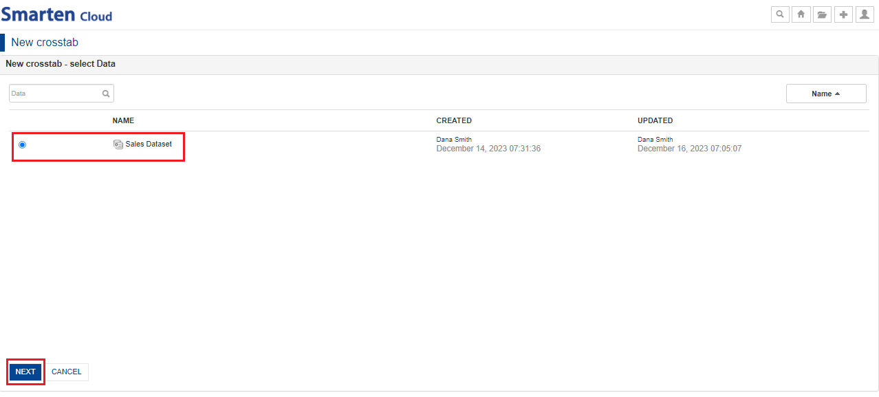
SELECT DATASET
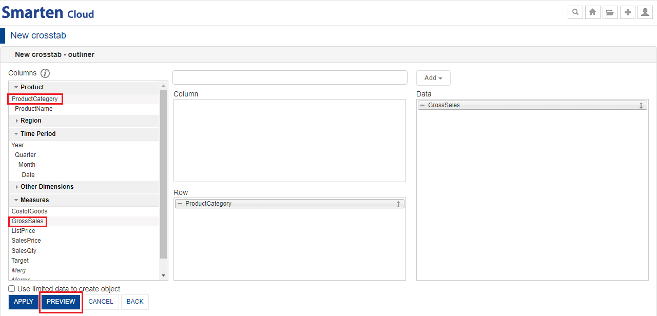
- System displays the outliner configuration screen. Crosstab outliner is divided into 3 sections: Row, Column and Data. It shows available Dimension and Measure columns in the “Columns” section. To create a new Crosstab, you need to assign the Dimension(s) to “Row” and “Column” sections while the Measure(s) to “Data” section in the outliner.
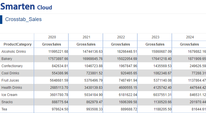
- Let’s create ProductCategory wise Sales crosstab report.
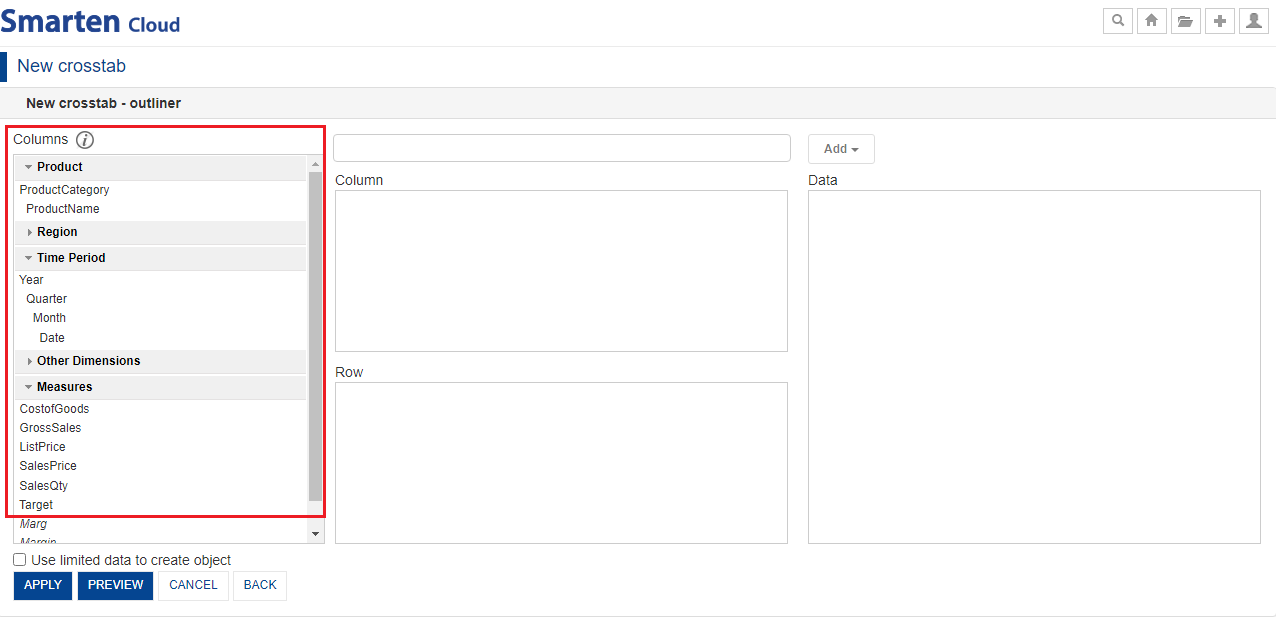
CROSSTAB-OUTLINER-COLUMNS
- Select the dimension “Product>ProductCategory” and drag-and-drop in the “Row” section. Alternatively, you can type and search the dimensionand click “Add” and select “Row” from the drop-down list to add any dimension column in the “Row” section.
- Select the measure “GrossSales” and drag-and-drop in the “Data” section. Alternatively, you can type and search the measure and click “Add” and select “Data” from the drop-down list.
- Click “PREVIEW” to preview how your Crosstab report looks like.
SELECT DIMENSION-MEASURE
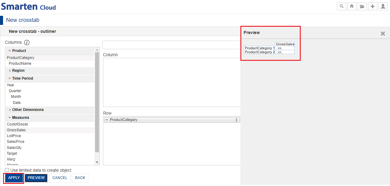
- “Preview” screen shows resultant output in the following way. After preview, you can click “APPLY”.
APPLY COLUMNS
- System displays the “Product category” wise “Gross Sales” in a tabular form. By default, system selects “Sum” data operation for “GrossSales” measure. If you want to change the data operation, you can right click on “GrossSales” column and mouse over to “Data operation” and select required data operation.
- Click the “Save” icon from the toolbar to save the Crosstab as “Crosstab_Sales”.
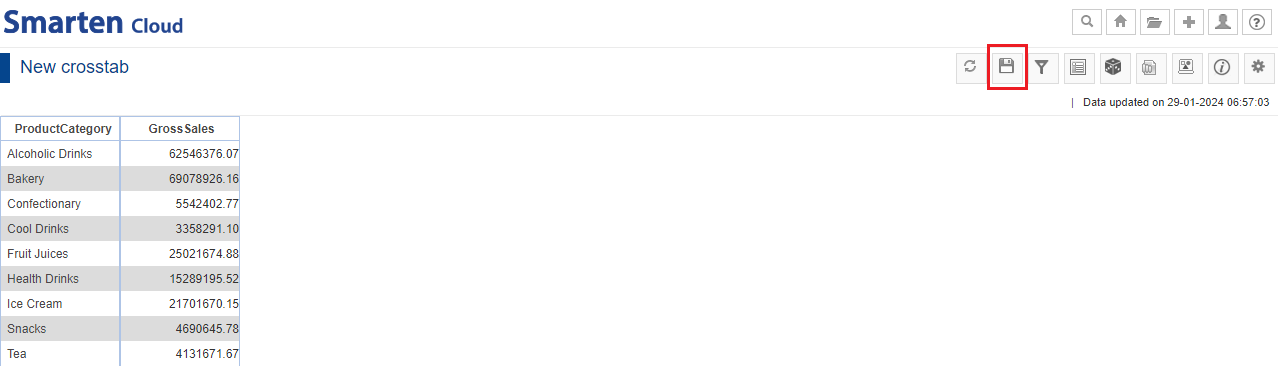
CROSSTAB-PRODUCT CATEGORY-GROSS SALES
Smarten supports following data operations on measure columns:
| Sr. no. | Data Operation | Description |
| 1. | Sum | Sum of all values |
| 2. | Average | Average of all values |
| 3. | Effective Average | Average of all “not null” values |
| 4. | Count | Count of all values |
| 5. | Effective Count | Count of all “not null” values |
| 6. | Maximum | Highest among all the values |
| 7. | Minimum | Lowest among all the values |
| 8. | First | First among all the values |
| 9. | Last | Last among all the values |
| 10. | Distinct Count | Unique (Distinct) count value of specified dimension |
| 11. | Distinct Sum | Sum of Unique (Distinct) value of a specified dimension |
| 12. | Distinct Average | Average of Unique (Distinct) value of a specified dimension |
| 13. | Most Recent | Most recent records from the data as per the date dimensions |
| 14. | Least Recent | The first records from the data as per the date dimensions |
| 15. | Row Percentage | Summary Percentage value against row level summary |
| 16. | Row Group Percentage | Group summary percentage value against row level summary (within same group) |
| 17. | Column Percentage | Summary percentage value against column level summary within the same column |
| 18. | Column Group Percentage | Group summary percentage value against column level summary (within same group) |
| 19. | Total Percentage | Summary Percentage value against total crosstab sum |
| 20. | Relative Row Difference | Difference with respect to the previous summary row |
| 21. | Relative Row Difference Percentage | Difference with respect to the previous summary row in percentage |
| 22. | Relative Column Difference | Difference with respect to the previous summary column |
| 23. | Relative Column Difference Percentage | Difference with respect to the previous summary column in percentage |
| 24. | Row Cumulative Sum | Cumulative sum of all previous row summaries in the same row |
| 25. | Column Cumulative Sum | Cumulative sum of all previous column summaries in the same column |
6.1. Add Column Dimension (Break up ProductCategory wise Sales by Year)
This section will explain how to create Crosstab object from “Sales Dataset” dataset which you created above.
- Now, let’s break up ProductCategory wise sales filters by Year.
- You can re-open the Outliner by clicking the “Outliner” icon on the Crosstab toolbar for adding more columns.
- Now, let’s select the dimension “Time Period>Year” and drag-and-drop in the “Column” section to get the yearly breakup of “Gross Sales”. Alternatively, you can type and search the dimension and click “Add” and select “Column” from the drop-down list.
- Click “PREVIEW” and then, click “APPLY”.
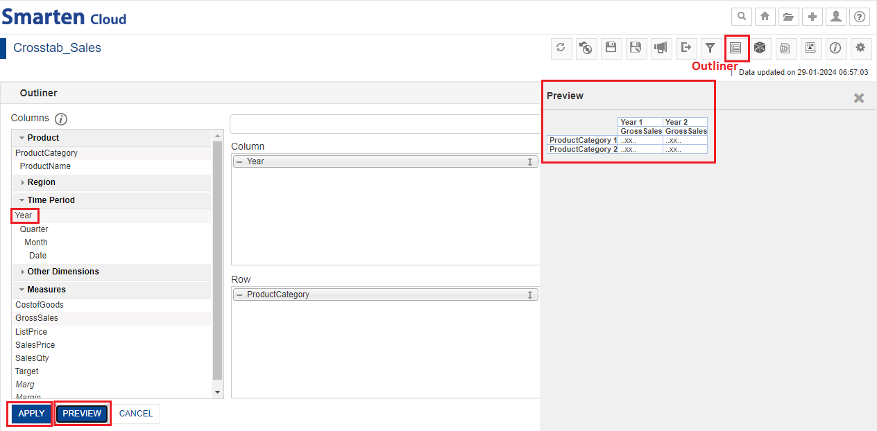
ADD COLUMN DIMENSION
- You will finally get the yearly breakup of gross sales for different product categories.
YEARLY BREAKUP OF GROSS SALES FOR PRODUCT CATEGORIES
6.2. Add dimension column on the fly
- You can add any dimension column on the fly in Crosstab. If you want to see ProductCategory sales by breaking up into “Prodcutname”. Let’s add “ProductName” under “ProductCategory”. Right-click anywhere on “ProductCategory” column; mouse-over to “Add” and select “Product Name” column.
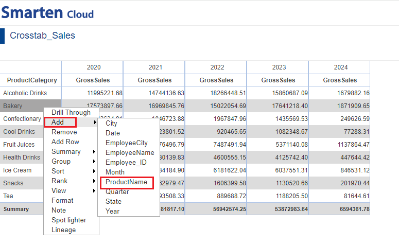
ADD COLUMN-PRODUCT NAME
- You will get the Productwise breakup of gross sales of all the product categories.
YEARLY GROSS SALES-PRODUCT CATEGORY-PRODUCT NAME
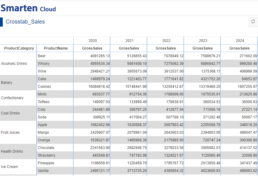
6.3. Summary Operations
- Summary Operation is used to calculate the summary at multiple levels of row and column dimensions.
- For the current crosstab, you can obtain the summary of gross sales of different product categories for each year. Right-click on any “ProductCategory”, mouse-over on “Summary” and click on “Settings”.
SUMMARY SETTINGS
- For the current crosstab, select default summary operation if you want to auto select summary operation based on data operation applied on that measure. Click “OK”.
- If you want to choose any other summary operation and obtain the “Summary”, you can select the desired operation from the drop-down list.
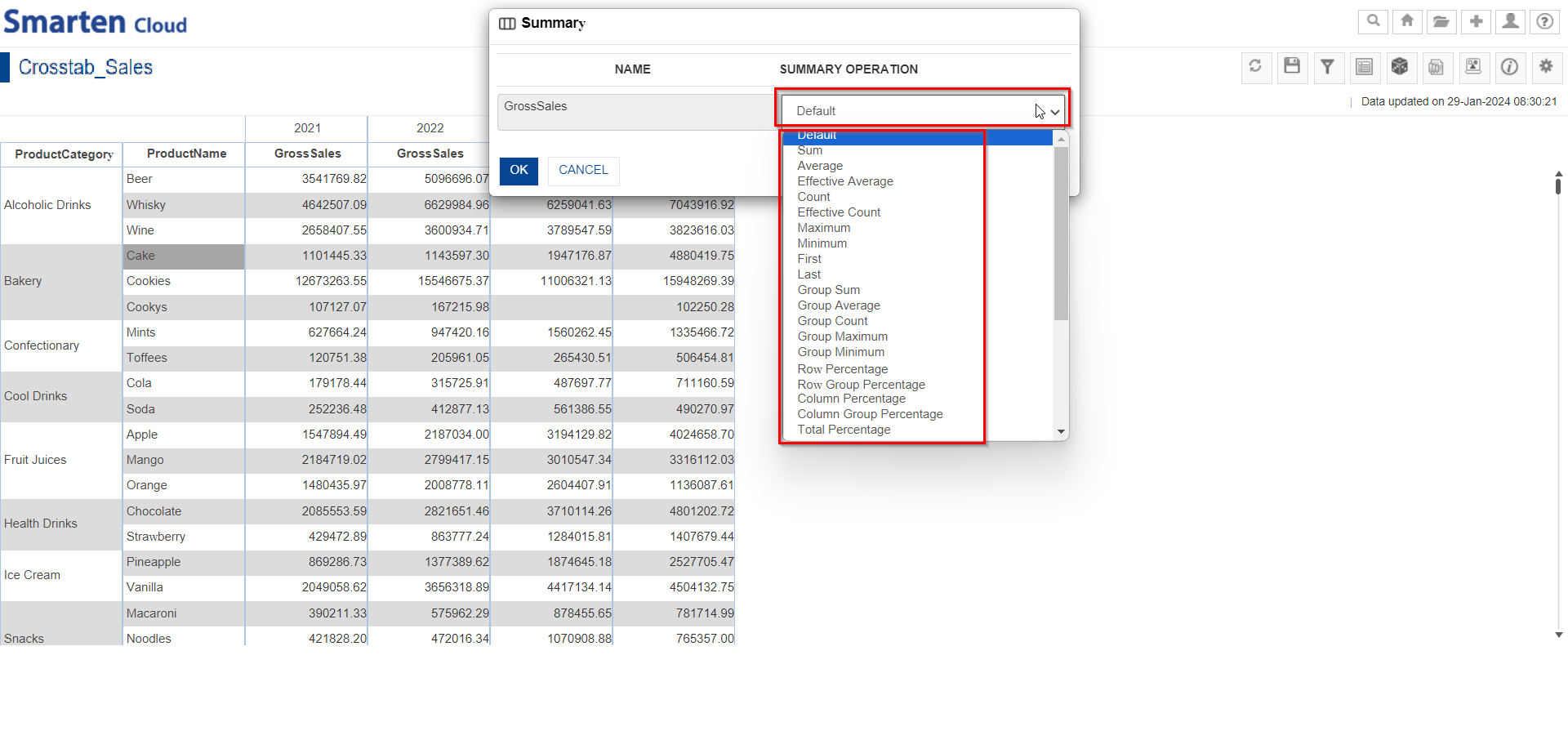
SELECT SUMMARY-OPERATIONFOR GROSS SALES
- System displays the “ProductCategory” grand summary at the last row of the table as shown below.
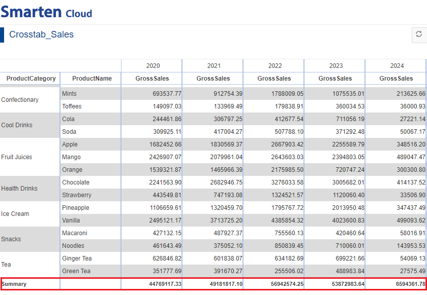
YEARLY SUMMARY OF GROSS SALES OF PRODUCT CATEGORY
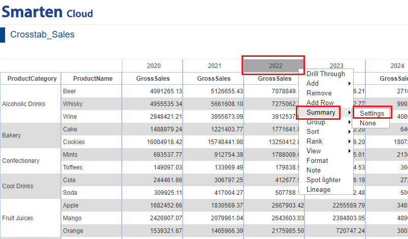
- Similarly, you can apply column summary for Year. Right-click on the any year value, mouse-over to “Summary” and select “Settings.”. In the “Summary” dialog box, keep the “Default” settings. Click “OK”.
SUMMARY SETTINGS FOR PRODUCT NAME
- System displays the column summary as shown below.
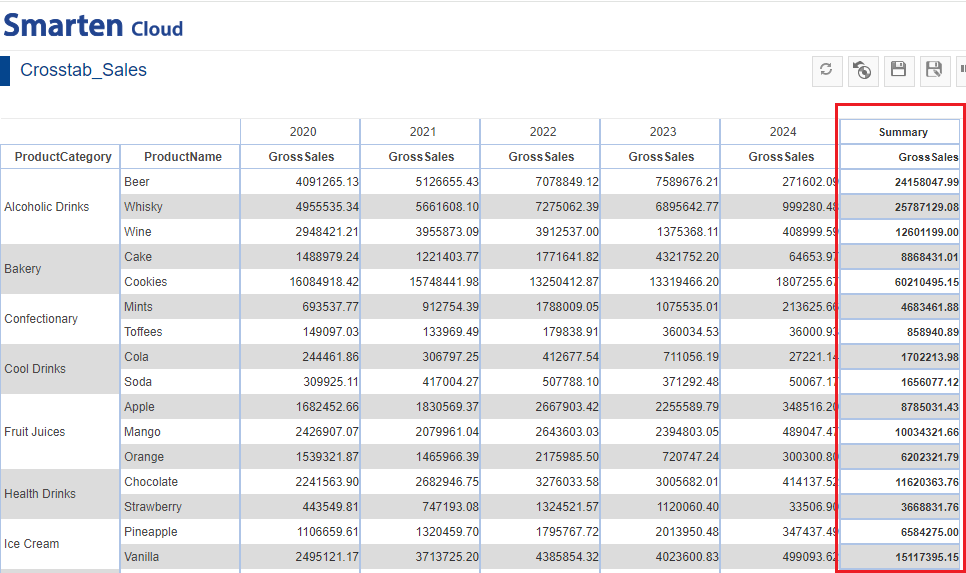
SUMMARY-GROSS SALES-PRODUCT NAME
Smarten supports following summary operations:
| Sr. no. | Summary Operation | Description |
| 1. | Sum | Sum of all values |
| 2. | Average | Average of all values |
| 3. | Effective Average | Average of all “not null” values |
| 4. | Count | Count of all values |
| 5. | Effective Count | Count of all “not null” values |
| 6. | Maximum | Highest among all the values |
| 7. | Minimum | Lowest among all the values |
| 8. | First | First among all the values |
| 9. | Last | Last among all the values |
| 10. | Default | Summary based on data operation applied on the columns. |
| 11. | Group Sum | Total/Sum of all values across a row or column at group level |
| 12. | Group Average | Average of all values within the same group |
| 13. | Group Count | Count of all values within the same group |
| 14. | Group Maximum | Highest among all the values within the same group |
| 15. | Group Minimum | Lowest among all the values within the same group |
| 16. | Row Percentage | Summary Percentage value against row level summary |
| 17. | Row Group Percentage | Group summary percentage value against row level summary (within same group) |
| 18. | Column Percentage | Summary percentage value against column level summary within the same column |
| 19. | Column Group Percentage | Group summary percentage value against column level summary (within same group) |
| 20. | Total Percentage | Summary Percentage value against total crosstab sum |
| 21. | Relative Row Difference | Difference with respect to the previous summary row |
| 22. | Relative Row Difference Percentage | Difference with respect to the previous summary row in percentage |
| 23. | Relative Row Group Difference | Difference with respect to the previous summary row for respective group |
| 24. | Relative Row Group Difference Percentage | Difference with respect to the previous summary row in percentage for respective group |
| 25. | Relative Column Difference | Difference with respect to the previous summary column |
| 26. | Relative Column Difference Percentage | Difference with respect to the previous summary column in percentage |
| 27. | Relative Column Group Difference | Difference with respect to the previous summary column for particular group |
| 28. | Relative Column Group Difference Percentage | Difference with respect to the previous summary column in percentage for particular group |
| 29. | Row Cumulative Sum | Cumulative sum of all previous row summaries in the same row |
| 30. | Row Group Cumulative Sum | Cumulative sum of all previous row summaries in the same group |
| 31. | ColumnCumulative Sum | Cumulative sum of all previous column summaries in the same column |
| 32. | Column Group Cumulative Sum | Cumulative sum of all previous column summaries in the same column |
6.4. Add Custom Measure(UDDC)
- Custom measures(UDDC) can be created by building expression on existing columns.
- For the current Crosstab, let’s add UDDC to derive the “Margin”.
- In order to add UDDC for Margin, you need to click on any row in “GrossSales” column. Right-click to “Add Column”.
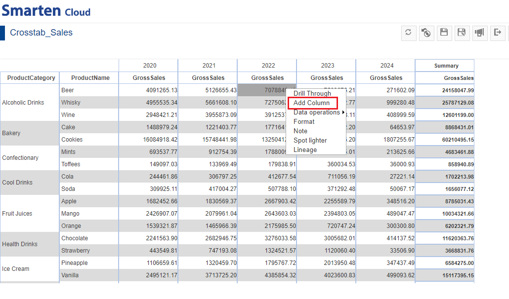
ADD COLUMN-UDDC
- You can create or edit expression by direct edit in the Expression box or by double clicking values from Columns, Functions, and Operators boxes.
- In Add Custom Measure(UDDC) dialog box, give the name “Margin”.
- In the Expression box, type the expression ((GrossSales-CostofGoods)/GrossSales)*100.
- Verify the expression for validity. Click “OK”.
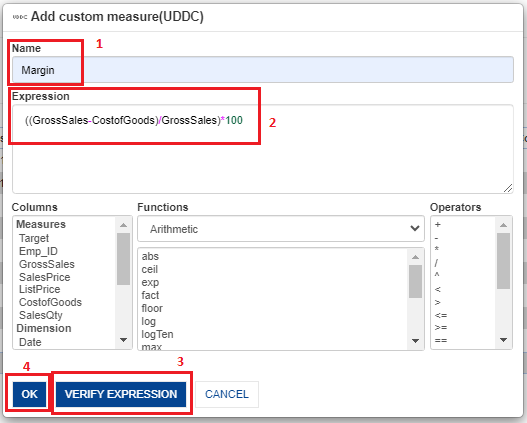
ADD CUSTOM MEASURE(UDDC)
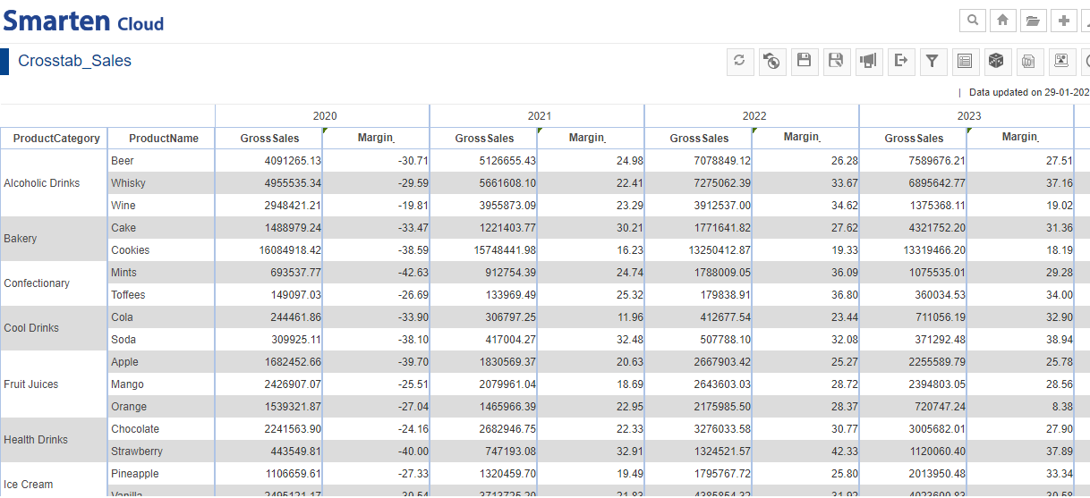
- The system adds the “Margin” column with calculated values next to “GrossSales” column.
ADD UDDC FOR MARGIN
6.5. Drill Up/Down
- You can use the “Drill Up/Down” functionality as per requirement. Click on any Year like “2023”. The table drills down the “GrossSales” of the “ProductCategory” and “ProductName” on “Quarter” basis. Similarly, you can click on any Year’s “Quarter” to drill down on “Month” basis.
CROSSTAB-DRILL DOWN
- If you want to “Drill Up”, click on “Drill Up” icon. You can drill up to ‘’Quarter” and then, “Year”.
CROSSTAB-DRILL UP
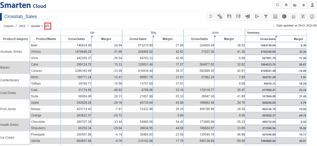
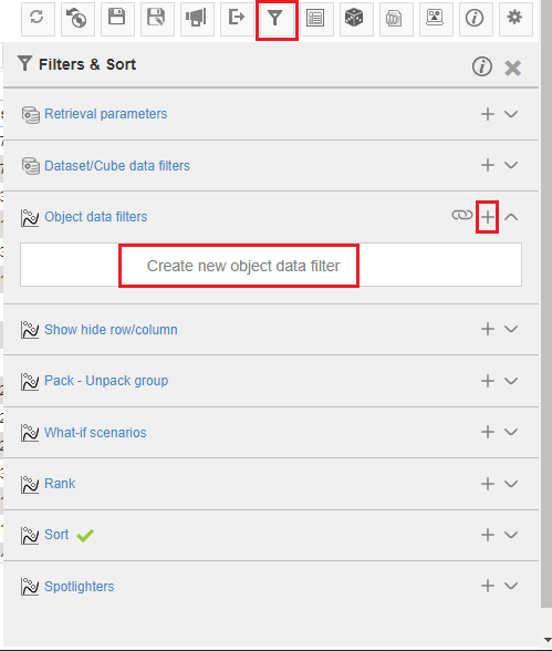
6.6. Add Filters
You can filter and sort by clicking “Filters & Sort” icon. Select “Object Data Filter”. Click the “Plus” icon or you can click inside the “Create New Object Filter” to add filters.
CROSSTAB-OBJECT DATA FILTER
- You can filter any Dimension or Measure that are part of the current Crosstab. By default, “Filter” is selected.
- Suppose, you want a “ProductCategory” to be same as ‘Alcoholic Drinks’ and ‘Bakery’. Select “Column” as ‘ProductCategory’; ‘=’ sign; “Criteria based on” ‘List of Values’ and select values to be filtered.
- Click “ADD” to get the preview of the selected options. Click “APPLY” to apply the filter for the final output.
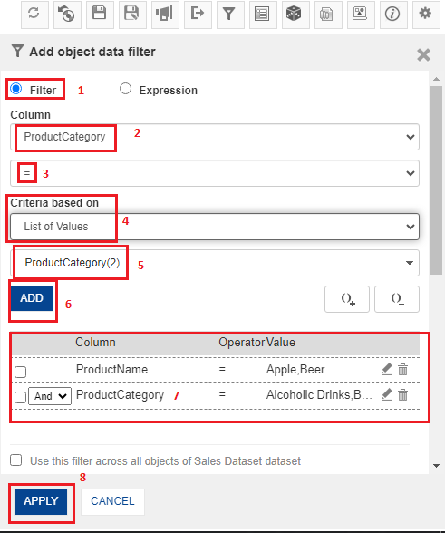
ADDOBJECT DATA FILTER
- System will display the Crosstab after applying filters.
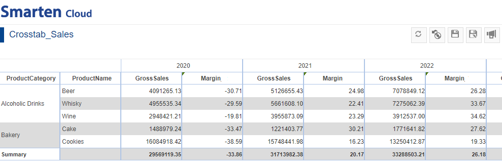
CROSSTAB AFTER ADDING FILTERS
Smarten provides following types of filters:
| Sr. no. | Filter Type | Description |
| 1. | Retrieval parameters | Users can use retrieval parameters to obtain a filtered view of BI object while loading the object. |
| 2. | Dataset/Cube data filters | User can apply filters on dataset and cube data with comprehensive filter options such as Time series and expressions. |
| 3. | Object data filters | User can apply filter on object data using this option. |
| 4. | Pack-Unpack group | User can pack or unpack group of values on-the-fly for quick analysis of data. |
| 6. | What-if scenarios | User can select global variables and change their values to analyze what-if scenarios. |
| 7. | Rank | User can rank or filter data based on top or bottom n values. |
| 8. | Sort | User can apply sorting on multiple columns with basic and advance options. |
| 9. | Spotlighters | User can highlight values based on conditions. |
6.7. Menus and Navigation in Crosstab
You can perform various operations from the tool bar and context menu.
- Toolbar menu: Refresh, Restore, Save, Publish Now, Export, Filters and Sort, Outliner, Slice and Dice, Graph, Lineage Diagram, Information and Settings.
- Context menu: Add, Remove, Summary, Group, Sort, Rank, View, Format and others.
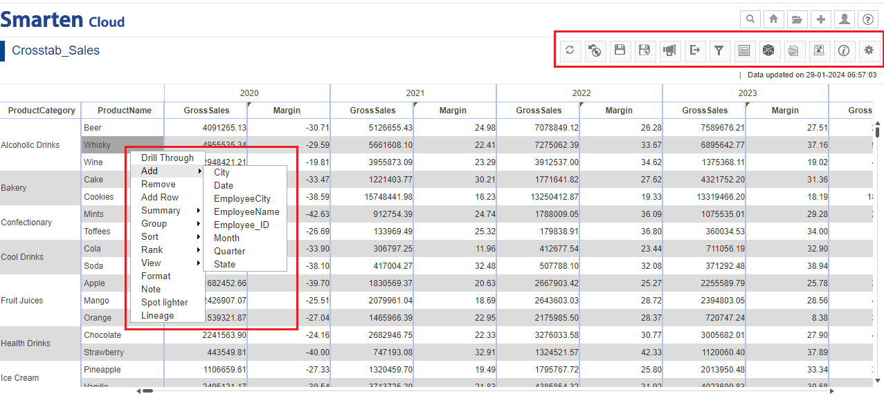
CROSSTAB-MENU-BARS
7. Create SmartenView
This section will explain how to create SmartenView object from “Sales Dataset” dataset.
- Click the option “Consume Data” from the home page.
CONSUME DATA
- Click on “SmartenView” to create new SmartenView object.

SMARTENVIEW
- Select the dataset “Sales Dataset” to create a SmartenView. Click “NEXT”.
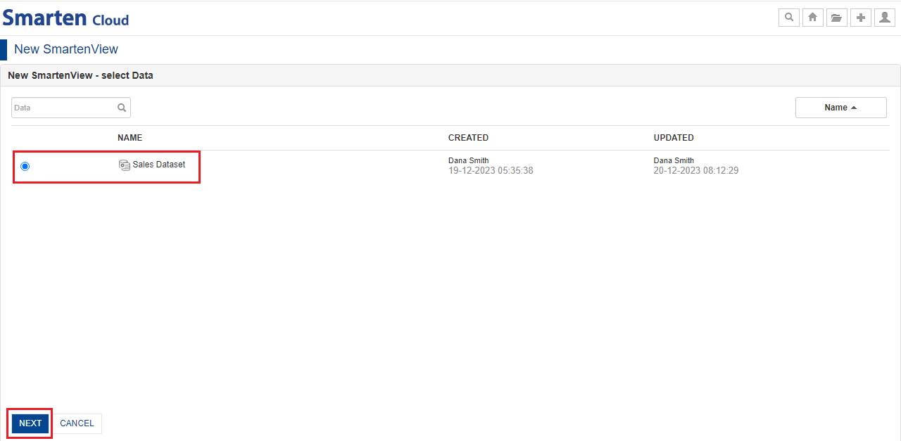
SELECT DATASET
7.1. Working with Smarten Mode ON
With the Smarten Mode ON, the system automatically suggests the best suitable option for visualizing and plotting a particular type of data.
You just need to drag-and-drop the required Dimension and Measure columns from the dataset and the system will render the best suitable visualization based on data type, volume, dimension patterns, and nature of data.
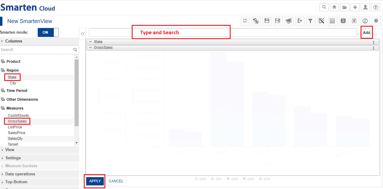
Let’s create Statewise Sales SmartenView report.
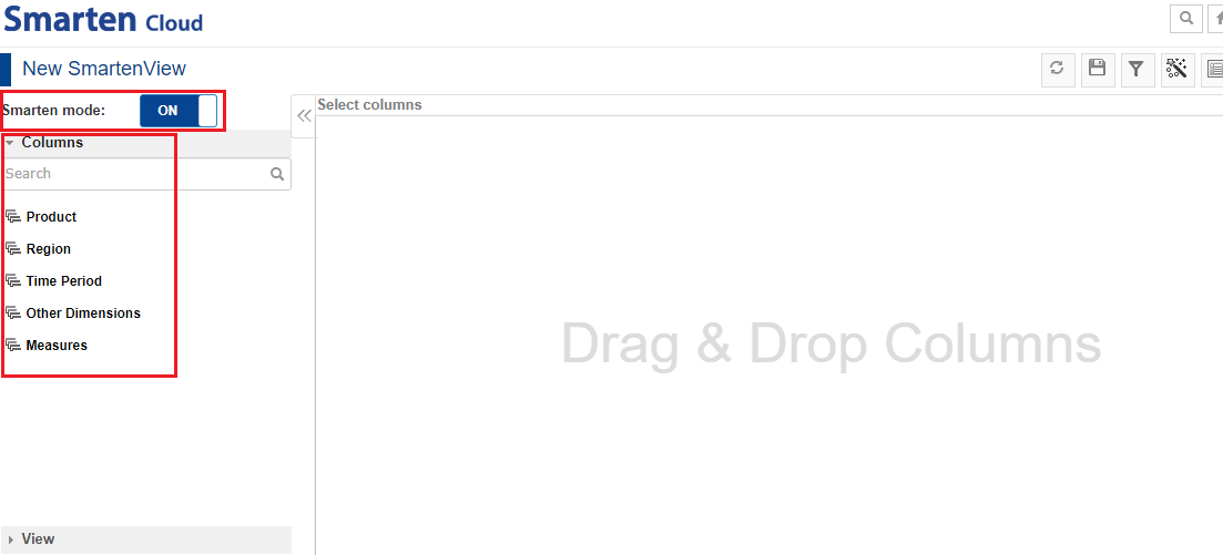
SMARTENVIEW-SMARTEN MODE ON-COLUMNS
- Select the dimension “Region>State” and drag-and-drop in the “Select Columns” section. You also need to drag-and drop the measure “GrossSales” in the same section. Alternatively, you can type and search the dimension/measure and click “Add” to add the column(s). Click “APPLY”.
SELECT COLUMNS
- System has recommended a pie chart as the best suitable option for visualizing and plotting the data depending upon its type, volume, dimensions, patterns, and nature. You can know the gross sales of each state if you mouse-over on the chart.
- Recommended visualization can be easily identified by a dark blue border.
- Click the “Save” icon from the toolbar to save the SmartenView as “SmartenView_Sales”.
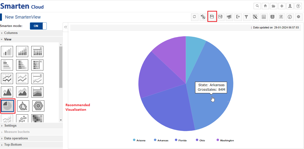
STATEWISE GROSS SALES – PIE CHART
7.2. Add More Columns (Break up Statewise Sales by Year)
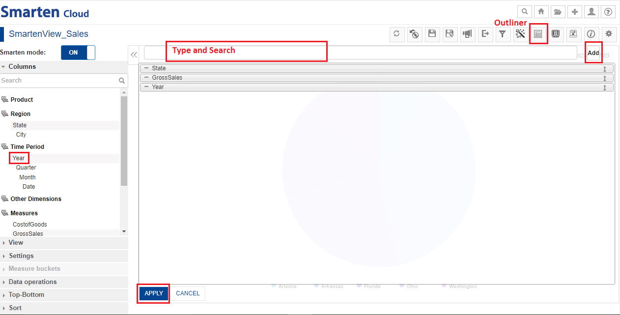
- Now, let’s break up Statewise sales filters by Year.
- You can re-open the Outliner by clicking the “Outliner” icon on the SmartenView toolbar for adding more columns.
- Now, let’s select the dimension “Time Period>Year” and drag-and-drop in the “Select Column” section to understand the yearly breakup of “Gross Sales” for the dimension “Region>State”. Alternatively, you can type and search the dimension and click “Add”. Click “APPLY”.
SMARTENVIEW-ADD MORE COLUMNS
- Here, the system has recommended a sunburst chart to represent the data. You can mouse-over the chart to know the yearly gross sales in each state. The inner circle shows the total gross sales for all the years of all the states.
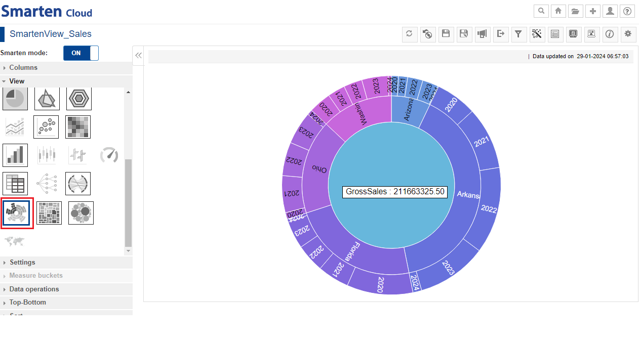
YEARLY STATEWISE SALES –SUNBURST CHART
7.3. Change Visualizations (View)
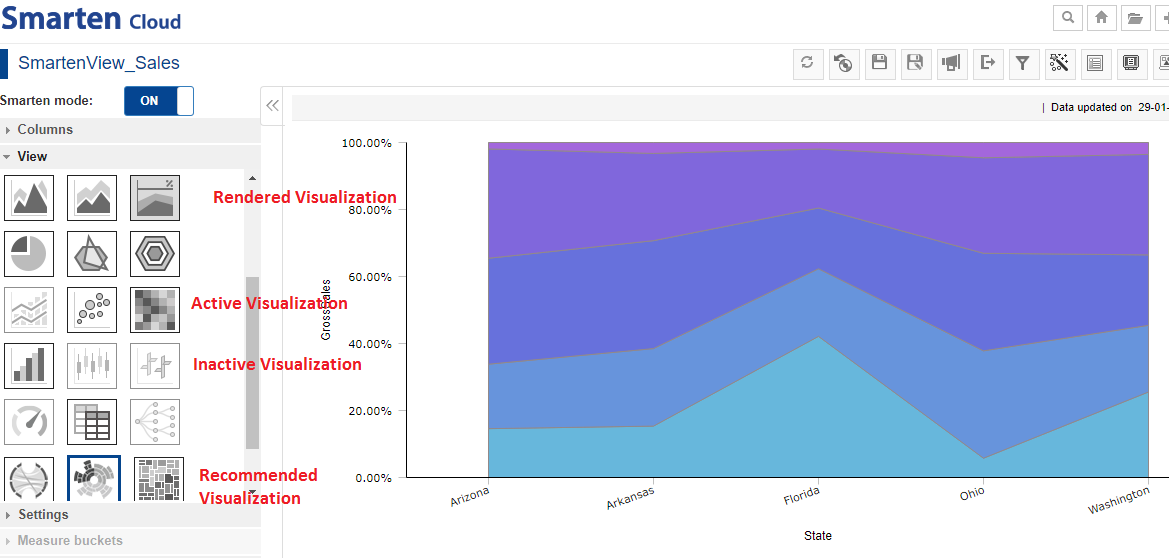
- You can change Visualizations by clicking on “View”. The system provides many ready-to-use graphs and charts to select and use.
- For the current SmartenView, the system has recommended the best suitable visualization through a sunburst chart which is highlighted with a blue border.
- Some visualization types may or may not be possible for the same data.
- Visualizations that are possible will be displayed as active, whereas the rest will remain inactive. Users can select from active visualizations to visualize the same data differently.
- A visualization that is currently being rendered on the screen can be identified by a grey shaded icon.
SMARTENVIEW-VISUALIZATIONS
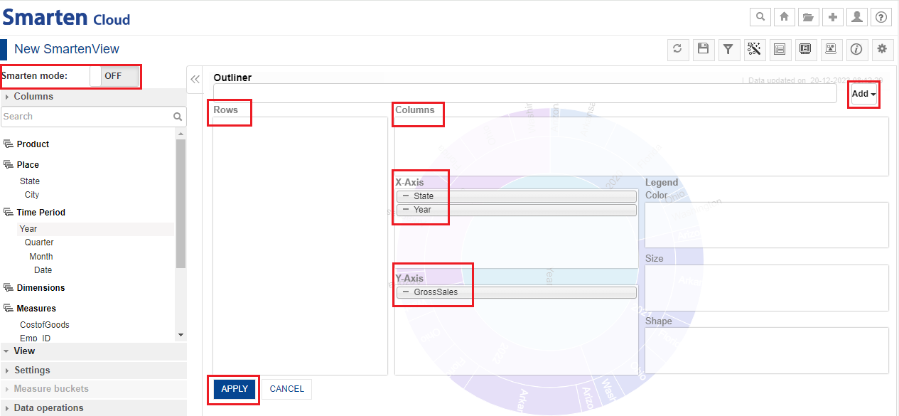
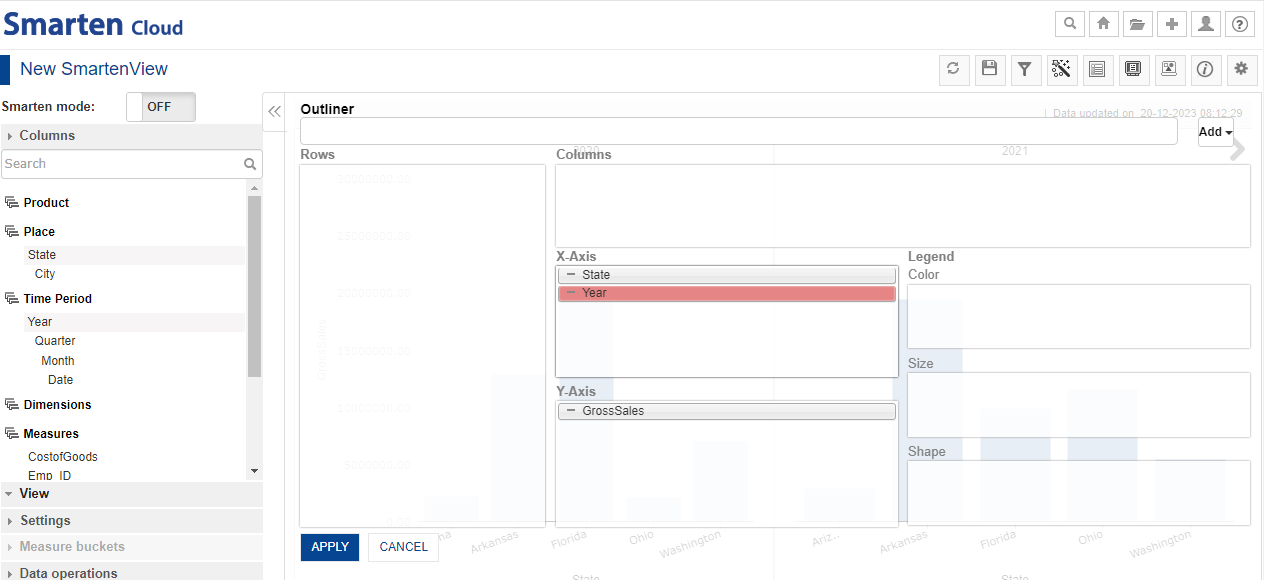
7.4. Working with Smarten OFF Mode
- Working with Smarten mode OFF allows you to have more control on what and how you want to visualize. By using Outliner, you can drag-and-drop Dimension and Measure Columns in the quadrants of Rows, Columns, X-Axis, Y-Axis, and Legend. The type of visualization rendered is based on the placement and number of these columns in the Outliner. In other words, you can place columns into the Rows, Columns, X-Axis, Y-Axis, and manage visualizations with color, shape, and size. For example, in the image above, if you add the Year column to the X-Axis section, the system will use data of the Year column to form the X-Axis of the SmartenView.
- For the current SmartenView, the system has automatically selected “X-Axis” and “Y-Axis” for dimensions and measures respectively. For example, the system has selected the “GrossSales’ column to the Y-Axis section, the system will use data of the “GrossSales” column to form the Y-Axis of the SmartenView. You can “Add” more dimension(s) or measure(s) as per requirement and, then click “APPLY”.
SMARTENVIEW-OFF MODE
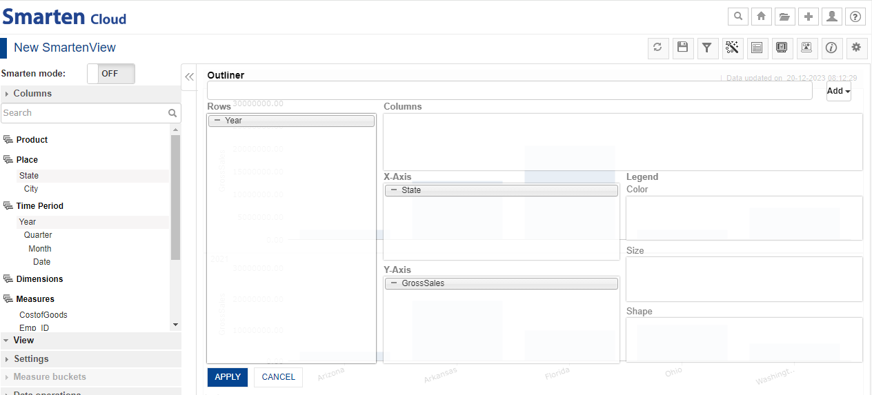
7.5. Changing the Placement of Columns
- If you want to change the placement of the current dimension(s) or measure(s), you can drag-and-drop in any of the boxes as per requirement.
- For the current SmartenView, the system recommends the need to have at least 2 dimensions in X-Axis column and at least 1 measure in Y-axis column.
- If you change the placement of any of columns for the selected SmartenView, the column might be highlighted. In other words, when you add a column to a section of the Outliner that is not applicable for the selected chart type, the system highlights such columns.
- Let’s change the placement of dimension “Region>State” to “Columns” section. Click “APPLY”.
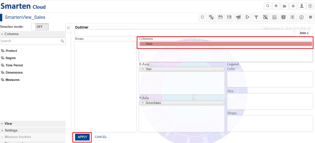
SMARTENVIEW-OFF-HIGLIGHTED COLUMN
- System will display the dialog box. It will give you a choice to use another type of visualization to represent the data on a graph/chart.
- Click “OK”.
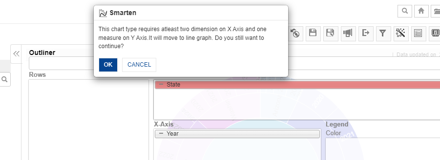
SMARTENVIEW-HIGLIGHTED COLUMN-DIALOG BOX
- System will display the best suitable visualization in the form of line graph.
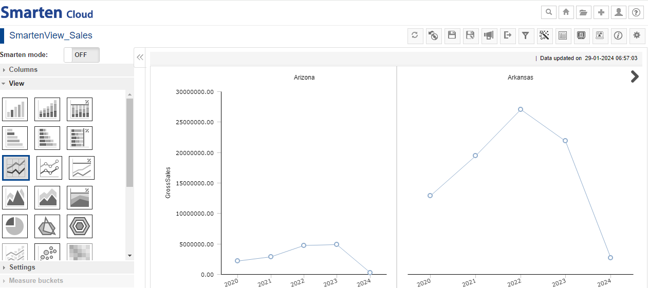
SMARTENVIEW-SUITABLE VISUALIZATION AFTER CHANGING COLUMN
- Similarly, when the chart type is changed and the columns available in any of the sections are not applicable for the new chart type, the system highlights such columns.
- For example, let’s change the current SmartenView (SUNBURST CHART) to a bar diagram, the system will highlight the dimension “Time Period>Year”.
SMARTENVIEW-BAR DIAGRAM-YEAR-HIGLIGHTED
- In that case, you can either “Add” the dimension “Time Period>Year” in “Rows” or “Columns” section and, then click “APPLY”.
SMARTENVIEW-OFF-BAR DIAGRAM-OUTLINER
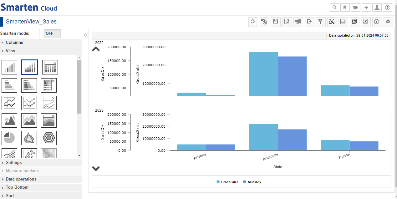
- The system will display the bar diagram of the current SmartenView in the following way.
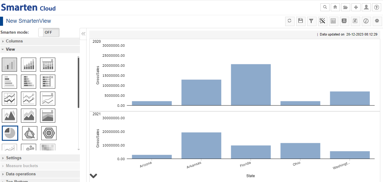
SMARTENVIEW-BARDIAGRAM
7.6. Using Legend-Color-Size-Shape
- When Smarten Mode is OFF, you have total control of visualization properties like color, size and shape and “Legend-Color, Size, Shape” Quadrants can be used as per requirement.
- For the current SmartenView, let’s add the measure “SalesQty” in Legend-Size quadrant.
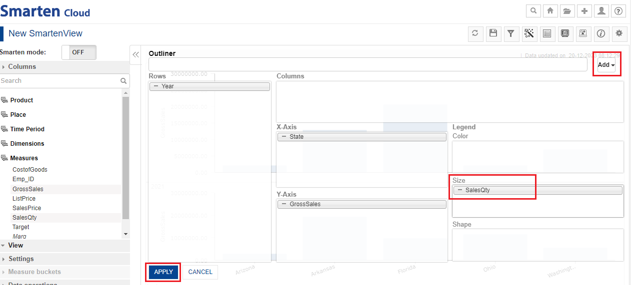
SMARTENVIEW-OFF MODE –LEGEND –SIZE- ADD QUANTITY
- The system will display the bar diagram with all the details in the following way.
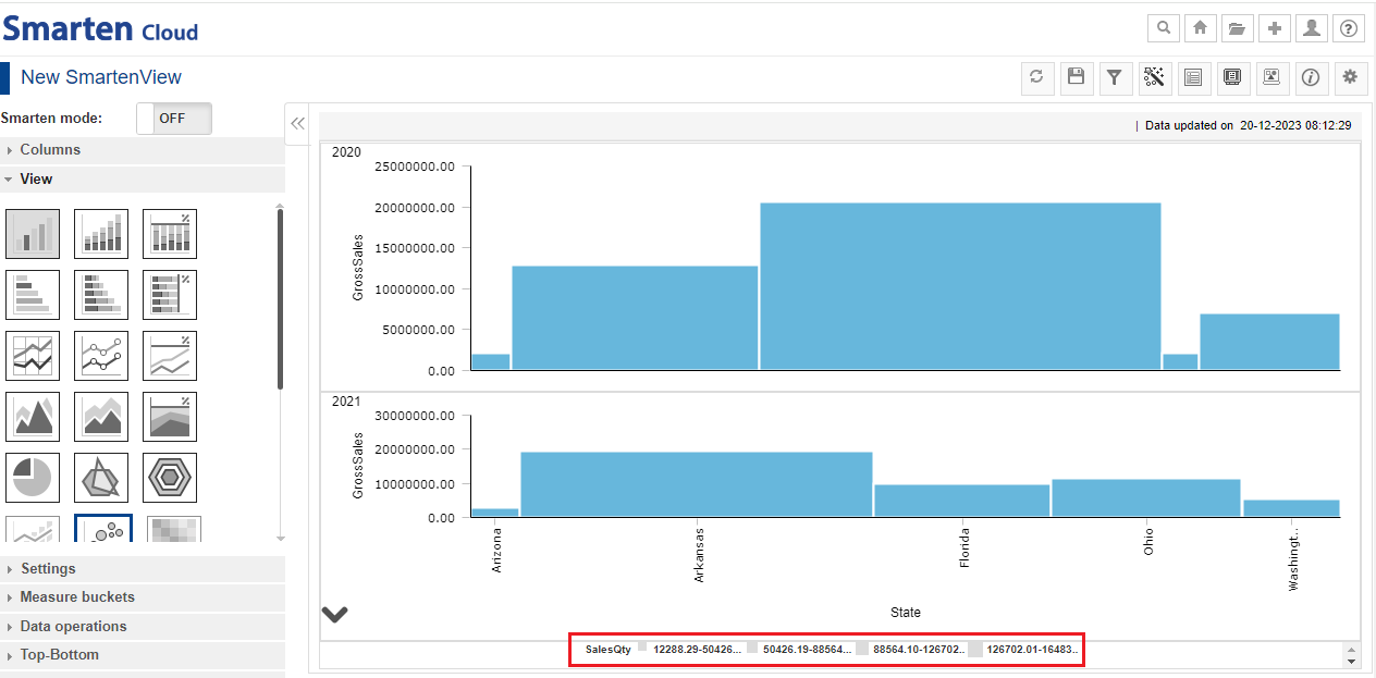
SMARTENVIEW-BAR DIAGRAM-SALES QUANTITY
7.7. Add Filters
- You can use filters as per requirement. Click on “Filters and Sort” icon. Select “Object Data Filters”. You can create filter(s) either by clicking the “Plus” sign or clicking inside the “Create new object data filter”.
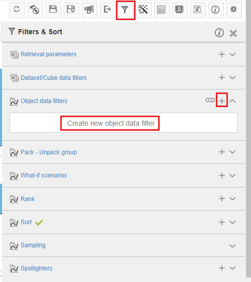
SMARTENVIEW-FILTERS
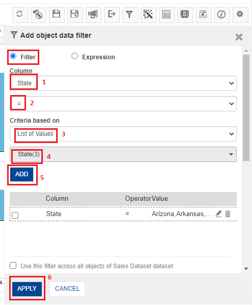
- By default, “Filter” is selected. Select Column as “State” with “=” sign; Criteria is based on “List of Values”- State (3). State (3) represents three states namely, Arkansas, Arizona and Florida. Click “ADD”. The table (below “ADD” button) will show the preview- the Column “State” being same as “Arkansas, Arizona, Florida”. You can add more filters by selecting from the “Column” of dimension(s) and measure(s) used in the current SmartenView. Click “APPLY” once filters are selected as per requirement.
SMARTENVIEW-ADD FILTERS
- System will display the Crosstab after applying filters.
SMARTENVIEW-ADD OBJECT FILTERS
| List of Filters | ||
| 1. | Retrieval parameters | |
| 2. | Dataset/Cube data filters | |
| 3. | Object data filters | |
| 4. | Pack-Unpack group | |
| 5. | What-if scenarios | |
| 6. | Rank | |
| 7. | Sort | |
| 8. | Sampling | |
| 9. | Spotlighters |
7.8. Menus and Navigation in SmartenView
You can perform various operations from the tool bar and other areas of the SmartenView screen.
1.The toolbar provides options to perform various operations on the chart, such Refresh, Restore, Save, Publish Now, Export, Filter and Sort, Data Operations, Outliner, and many more.
2.This option allows you to turn the Smarten Mode ON and OFF.
3.This option allows you to add columns, measures, dimensions, apply views, and change settings.
4.This area displays the chart based on the columns, dimensions, views, and other settings you have applied.
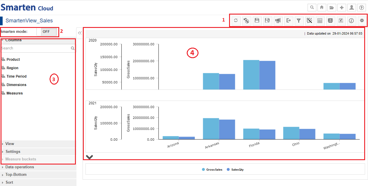
SMARTENVIEW-MENU-BARS
8. Create a Dashboard
This section will explain how to create Crosstab object from “Sales Dataset” dataset which you created earlier.
*Click the option “Consume Data” from the home page.

CONSUME DATA
- Click on “Dashboard” to create a new Dashboard object.
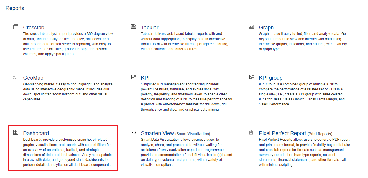
DASHBOARD
- Create a new Dashboard by selecting the options in the “New Dashboard’ dialog box as per requirement. New dashboard can be designed from scratch if you select the option “Create new from scratch”. The system will render a new Dashboard based on theme of any existing dashboard if you select the option “Create new from existing”.
- If you select “Responsive”, you will design only once and the system will automatically render dashboards based on target devices for optimum user experience across devices. “Fixed size” dashboards (fixed width and height in pixels) will be rendered in fixed width and height without any changes in section / object size and positions. Here, we will create a new Dashboard by keeping the default settings and then, click “OK”.
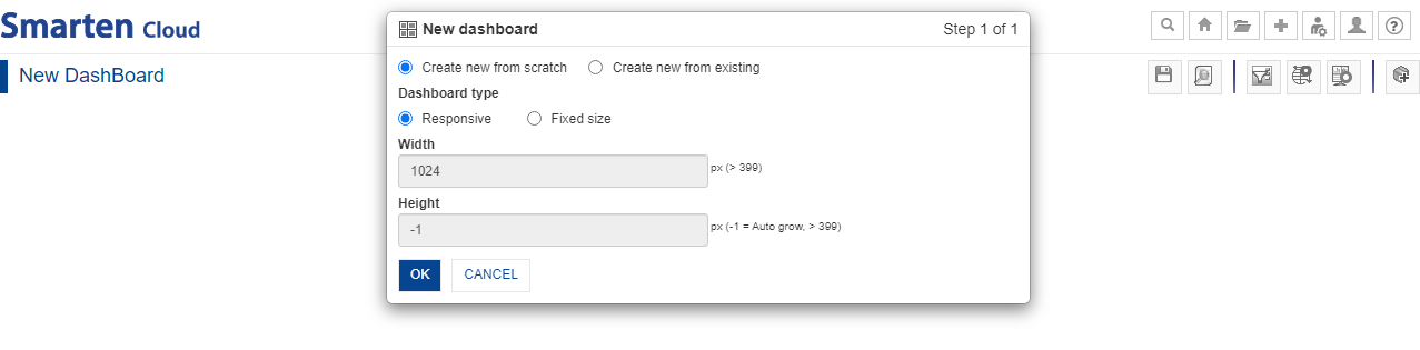
NEW DASHBOARD
- “Add Section” dialog box would be displayed on the screen. Alternatively, you can click the “Add Section” icon from the tool bar to add Crosstab and SmartenView.
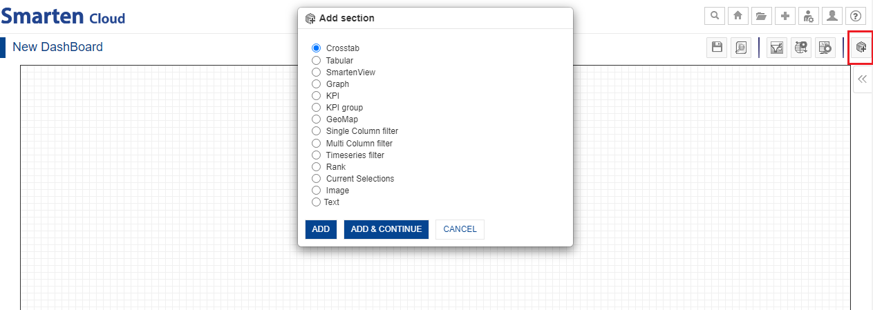
NEW DASHBOARD-ADD SECTION
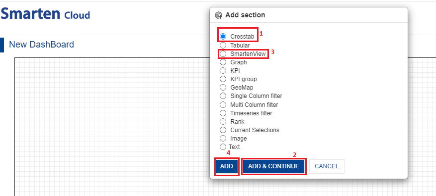
- You can add Crosstab by selecting the option “Crosstab” and clicking “ADD & CONTINUE”. Select “SmartenView” and click “ADD”.
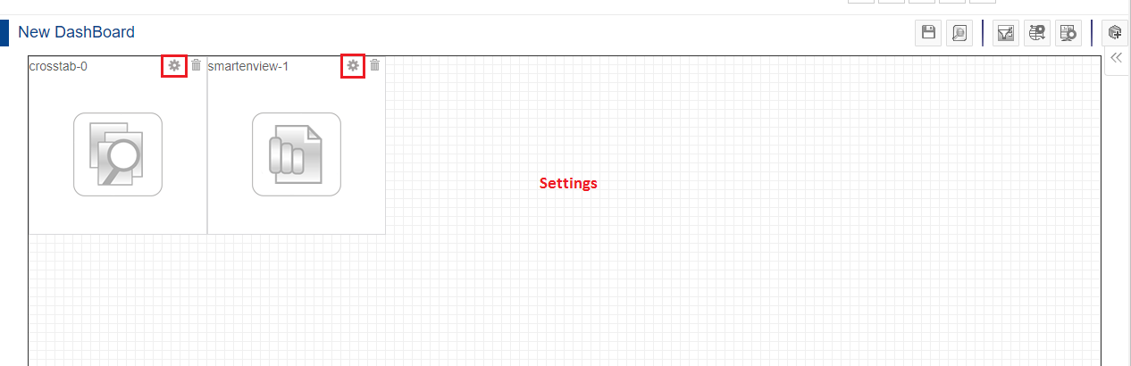
- The Dashboard will be displayed on screen in the following way. Crosstab and SmartenView will be integrated on the screen adjacent to each other.
- You can also change the size of each object by dragging from the corner(s). You can also change the placement of the objects by dragging any of the objects on the Dashboard screen.
- Click on “Settings” icon on the Crosstab and SmartenView to make further changes.
NEW DASHBOARD
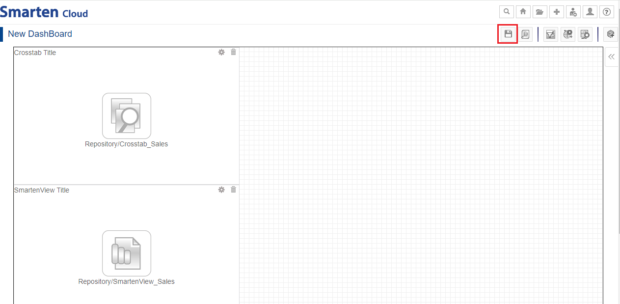
- For the current Dashboard, let’s make the changes in respective “Settings”. At first, let’s select “Settings>Associate Object” in the Crosstab Settings and select the Crosstab of your choice. Click “OK”. Here, we have selected “Crosstab_Sales”.
- Similarly, you can click the “Settings” icon on the SmartenView object and select “Associate Object” to select the SmartenView of your choice. Here, we have selected “SmartenView_Sales”.

DASHBOARD-ASSOCIATE OBJECT
- The new Dashboard would be displayed in the following way.
- Save the new Dashboard as “Dashboard_Sales”.
DASHBOARD-ASSOCIATE OBJECTS
- Click on “Preview” icon to check the preview of the new Dashboard.
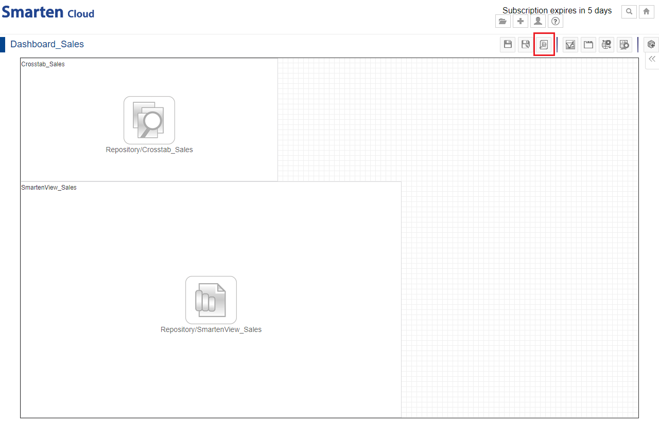
DASHBOARD-PREVIEW ICON
- Preview would reveal the integration of the Crosstab and the SmartenView objects on the Dashboard screen for quick understanding of the selected data.
- If you want to make more changes in the Dashboard, click the “Settings” icon from the tool bar and select “Design mode”.
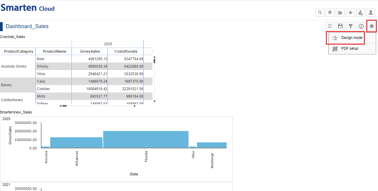
DASHBOARD-PREVIEW MODE
8.1. Menus and Navigation in SmartenView
You can perform various operations from the tool bars of the Dashboard screen.
- Design mode toolbar: Save, Preview, Manage Filter Associations, Manage global variables, Dashboard properties, and Add Section.
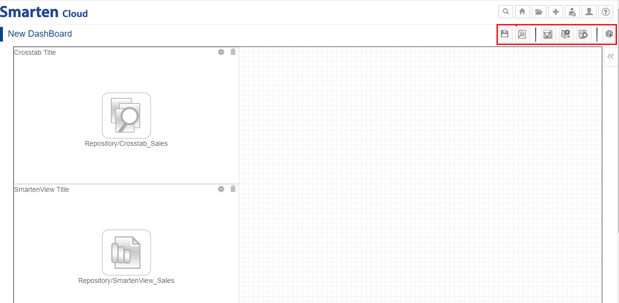
DASHBOARD-DESIGN MODE-TOOLBAR
- Preview mode toolbar: Refresh, Save, Filters, Information, and Settings.
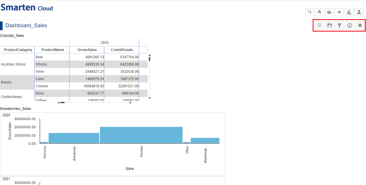
DASHBOARD-PREVIEW MODE-TOOLBAR
9. Create Autoinsights
This section will explain how to use the Autoinsights option to generate and explore the most accurate predictive models for the selected dataset “Sales Dataset”.
- Click the option “Consume Data” from the home page.
CONSUME DATA
- Click on “AutoInsights” to generate new “AutoInsights”.
SELECT AUTOINSIGHTS
- Select the dataset “Sales Dataset” from the list of datasets, and click “NEXT.”
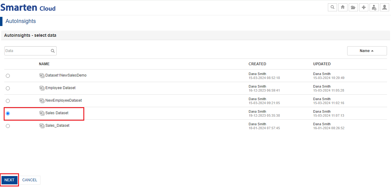
SELECT DATASET
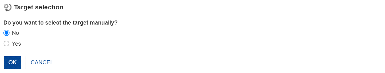
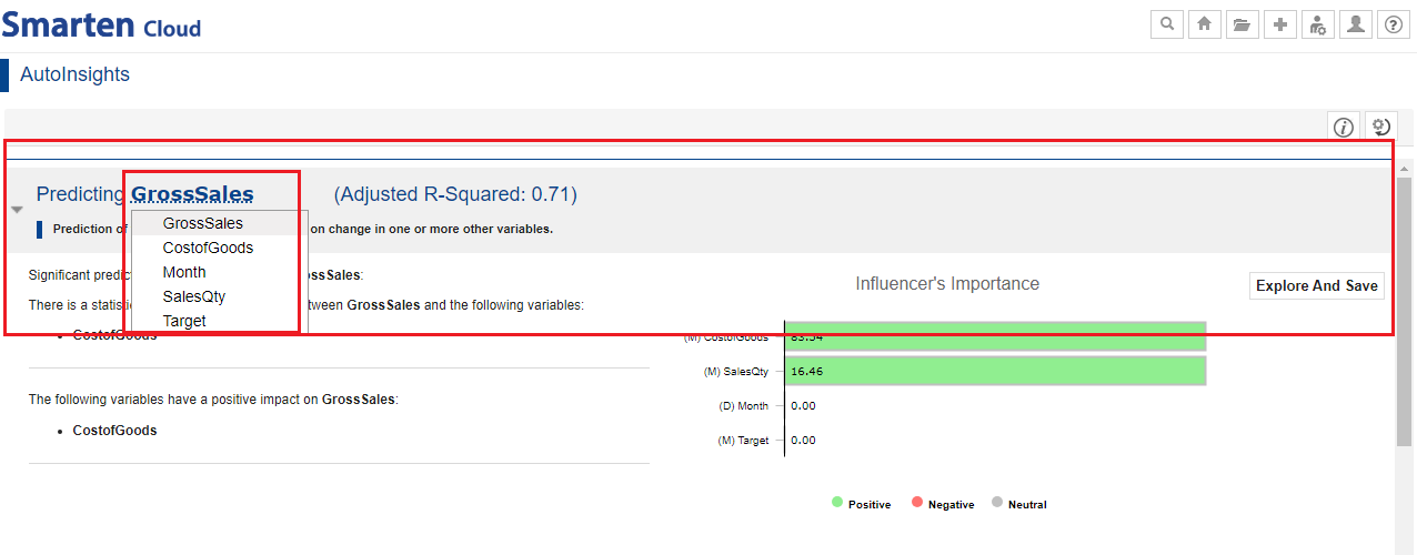
- You can select the target and predictors from the dataset.
If you select manual option, you can select targets and predictors manually and later on change target and predictors if you want to change auto-selected columns. If you select auto option, the system will automatically select target and predictors.
For this guide, let us select auto option. Select the “No” option in the target selection dialog, and click “OK” to let the system automatically select the target.
SELECT TARGET AND PREDICTORS
- The system will automatically generate various models for you as per the screen below.
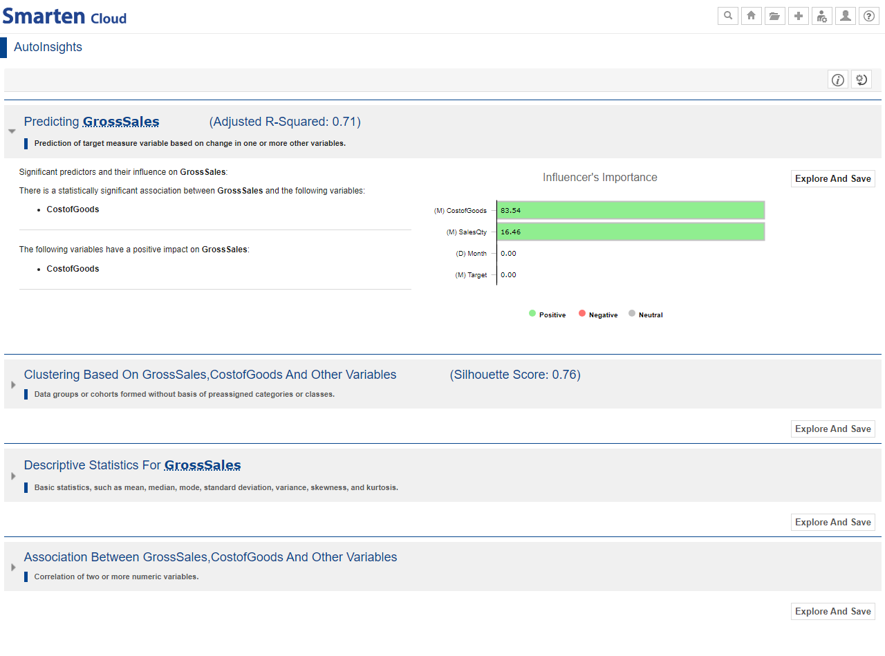
AUTOINSIGHTS MODELS LIST
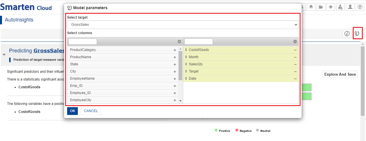
- You can change the model parameters by opening “Change model parameter” dialog from the top-right corner and regenerate Autoinsights based on your target and columns selection. For this example, we will not change them.
CHANGE MODEL PARAMETERS
- Click on the model heading to expand and see details of the model.
EXPANDED VIEW OF AUTOINSIGHT MODEL
- Click the “Explore and Save” button of the “Predicting charges” model to open and explore the model.
You can go back to Autoinsights by clicking the “Back to Autoinsights” link and explore another model.
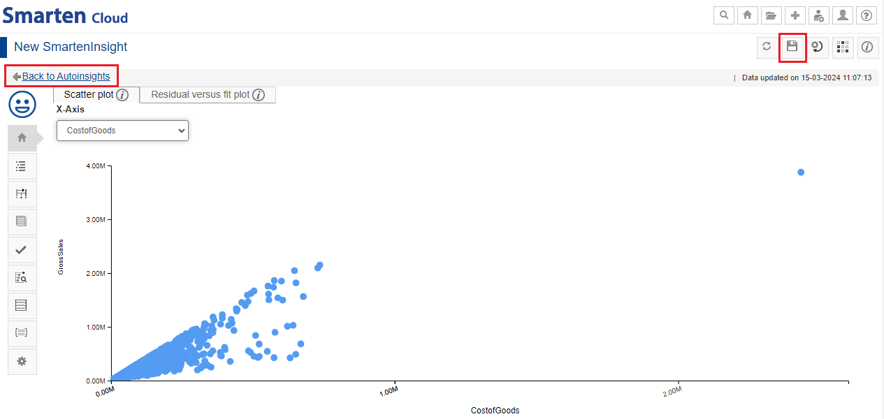
EXPLORE & SAVE AUTOINSIGHTS MODEL
Explore models in more detail with Interpretation, Model summary, Apply model, Key influencer analysis, simulation, etc., using the left toolbar.
Interpretation: You can view interpretation of the algorithm applied for regression. The interpretation provides information about insights of the model in simple language.
Model summary: You can view the model summary of the Smarten Insight regression object.
Data: You can view the data used for the SmartenInsight regression object.
Apply model: You can enter values for the input parameters and see the results of the model for regression.
Key influencers analysis: The Key Influencers Analysis enables you to analyze the data, rank the factors that impact the metric of interest, display them as key influencers, and present the visualizations and interpretations in simple language.
Simulation: You can apply the appropriate changes to the input parameters and obtain the results from the regression model.
- Save the model by clicking the “Save” icon for future use. You can share the model with your team members by saving it in the “Repository” folder.
SAVE & SHARE AUTOINSIGHTS
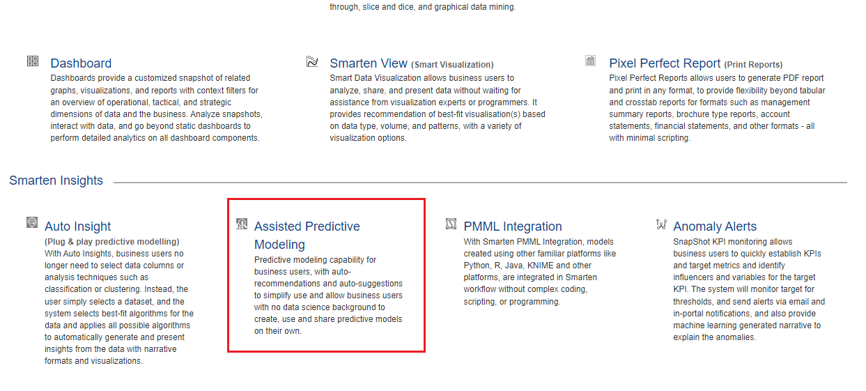
10. Use Assisted Predictive Modelling to create regression
This section will explain how to use assisted, guided workflow of Smarten Insights to generate predictive models for your dataset. You will be guided through data pre-processing options, algorithm technique selection, and a few other options.
- Click the option “Consume Data” from the home page.

CONSUME DATA
- Click on “Assisted Predictive Modelling”.
SELECT ASSISTED PREDICTIVE MODELING
- Select the dataset “Sales Dataset” from the list of datasets, and click “NEXT.”
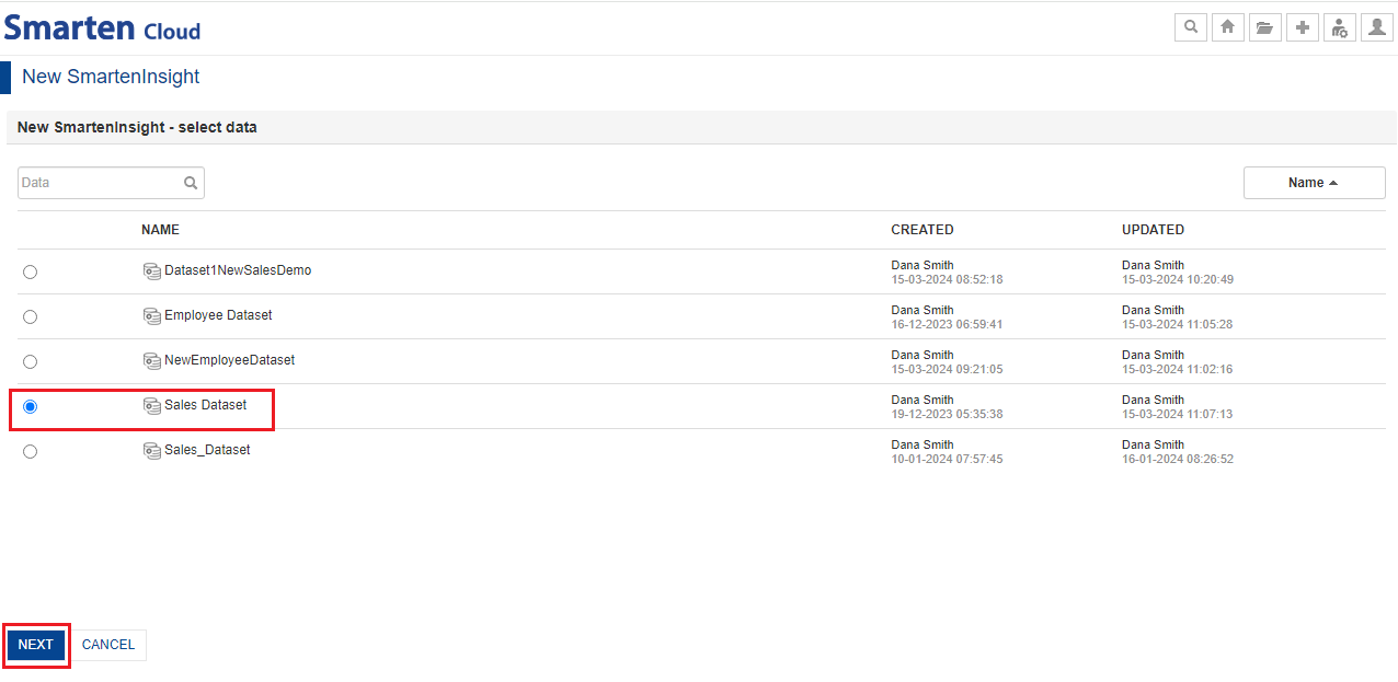
SELECT DATASET
- Select “Yes” to run the model on sample data on the “Sampling and Filtering” screen. If you select “No,” the model will be generated on full data.
- Select “No” to apply filters option and click “NEXT.” If you select “Yes,” the system will show the columns on which you can apply filters and ignore data you want.
For this guide, let us select default options and click “NEXT.”

SAMPLING & FILTERING OPTIONS
- Select “No” to handle outliers on the “Data Cleaning” screen. If you select “Yes,” the system will give you options to Remove or Replace the outliers.
- Select the “Remove” option to handle missing values. If you select “Replace," the missing values will be replaced by median in measures and by mode in dimensions.
Let us select default options and click “NEXT”.
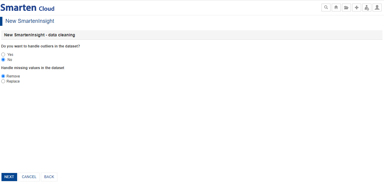
HANDLE OUTLIERS & MISSING VALUES
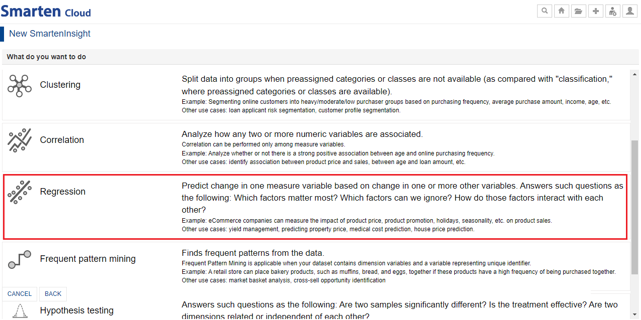
- The next screen will show you the list of predictive techniques. Let us select the “Regression” option here.
SELECT THE ALGORITHM TECHNIQUE
List of algorithm techniques:
| Algorithm Technique | Description & Example |
| Forecasting |
Forecast values for the future based on past values with one or more variables affecting future values. Forecasting can be performed based upon either the time period or unique identifier. Example: Forecast product sales based on past sales, inflation, and GDP growth. Other use cases: product/service demand forecasting, inventory management, GDP forecasting, tourism forecasting. |
| Classification |
Split data into groups based on preassigned categories or classes. Classification is applicable in predicting dimension target variable with at least two categorical values. Example: An applicant for a new loan can be assigned likely/unlikely defaulter categories based on the preassigned defaulter/non-defaulter category for older applicants. Other use cases: credit card fraud, crime/no crime analysis, customer churn prediction, plant species classification. |
| Clustering |
Split data into groups when preassigned categories or classes are not available (as compared with “classification,” where preassigned categories or classes are available). Example: Segmenting online customers into heavy/moderate/low purchaser groups based on purchasing frequency, average purchase amount, income, age, etc. Other use cases: loan applicant risk segmentation, customer profile segmentation. |
| Correlation |
Analyze how any two or more numeric variables are associated. Correlation can be performed only among measure variables. Example: Analyze whether or not there is a strong positive association between age and online purchasing frequency. Other use cases: identify association between product price and sales, between age and loan amount, etc. |
| Regression |
Predict change in one measure variable based on change in one or more other variables. Answers such questions as the following: Which factors matter most? Which factors can we ignore? How do those factors
interact with each other? Example: eCommerce companies can measure the impact of product price, product promotion, holidays, seasonality, etc., on product sales. Other use cases: yield management, predicting property price, medical cost prediction, house price prediction. |
| Frequent pattern mining |
Finds frequent patterns from the data. Frequent Pattern Mining is applicable when your dataset contains dimension variables and a variable representing a unique identifier. Example: A retail store can place bakery products, such as muffins, bread, and eggs, together if these products have a high frequency of being purchased together. Other use cases: market basket analysis, cross-sell opportunity identification. |
| Hypothesis testing |
Answers such questions as the following: Are two samples significantly different? Is the treatment effective? Are two dimensions related or independent of each other? Example: An eCommerce company can measure the regional influence on product category and gender influence on purchased product type. Other use cases: finding out if a medical treatment/promotional activity has been effective, if two river samples differ significantly in terms of pH level, etc. |
| Descriptive statistics |
Provides basic statistics, such as mean, median, mode, standard deviation, variance, skewness, and kurtosis. Descriptive Statistics can be performed for the measure variables in the dataset. |
Explore our CitizenDataScientist course for more on the basics of Citizen Data Scientist.
- The system will prompt you if you want to go with the auto-recommended target and predictors or not.
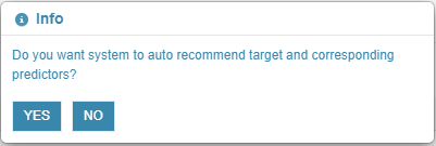
AUTO RECOMMENDATION-INFO BOX
- Select “YES” in the dialog box to let the system auto-recommend the target and predictors for now.
- If you select “NO,” you need to manually select the target and predictors variables. You can also choose the algorithm manually instead of auto-recommended by the system and whether you want to perform key influencer analysis or not.
- Click “NEXT” in the select variables screen with the system recommended target, predictors, and other options.
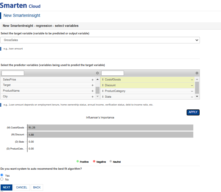
SELECT TARGET & PREDICTORS
- The model is generated with the best-fit algorithm for you.
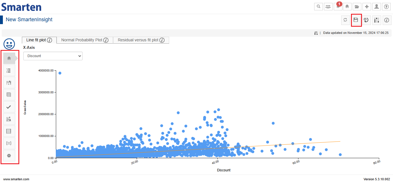
GROSS SALES REGRESSION MODEL
You can perform various actions described below using the left toolbar.
Interpretation: You can view the interpretation of the algorithm applied for regression. The interpretation provides information about insights of the model in simple language.
Model summary: You can view the model summary of the Smarten Insight regression object.
Data: You can view the data used for the SmartenInsight regression object.
Apply model: You can enter values for the input parameters and see the results of the model for regression.
Key influencers analysis: The Key Influencers Analysis enables you to analyze the data, rank the factors that impact the metric of interest, display them as key influencers, and present the visualizations and interpretations in simple language.
Simulation: You can apply the appropriate changes to the input parameters and obtain the results from the regression model.
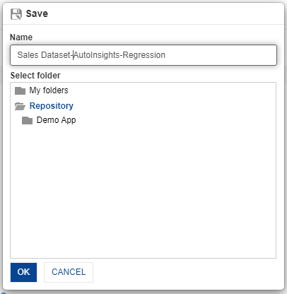
- Save the model by clicking the “Save” icon for future use. You can share the model with your team members by saving it in the “Repository” folder.
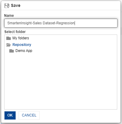
SAVE & SHARE MODEL
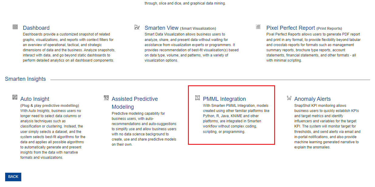
11. Import PMML file to validate and use customer churn model created in python
This section will explain how to create predictive models and leverage ready-to-use Smarten Insights workflow to validate the model and use the model for predictions using PMML files generated in other platforms like R and Python.
- Download the “customer churn PMML” file from the welcome email sent to you during registration process or copy the link below and paste it into your browser. https://app.smarten.com/pmml/customer_churn.pmml
- After downloading the file, log in to app.smarten.com.
- Click the option “Consume Data” from the home page.

SELECT PMML FILE OPTION ON HOME PAGE
- Click on “PMML Integration” to upload the downloaded file.
PMML INTEGRATION
- Upload the downloaded file “customer_churn.pmml”, and click “NEXT.”
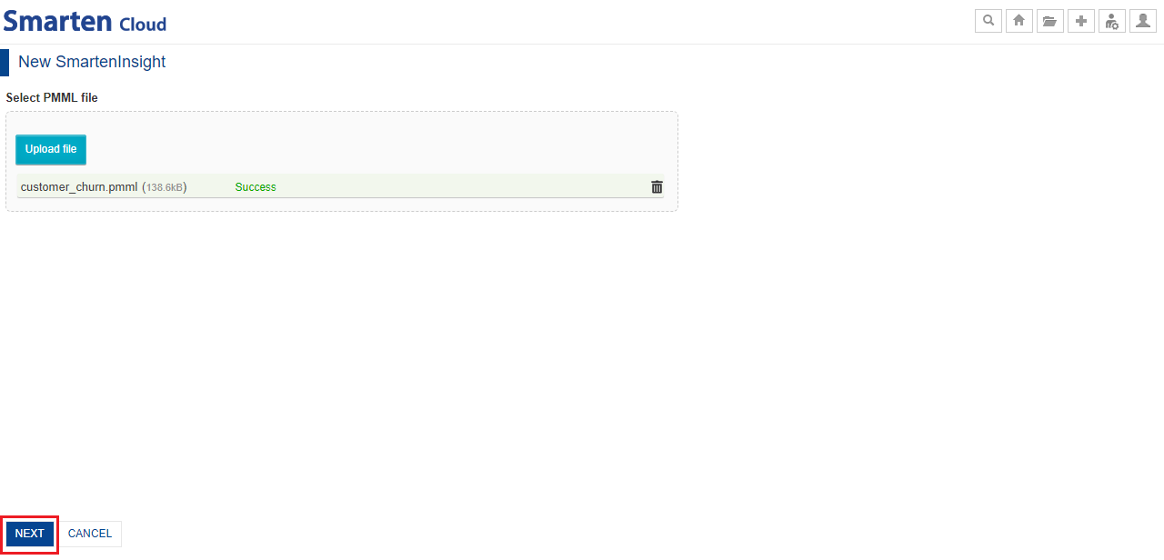
UPLOAD PMML FILE
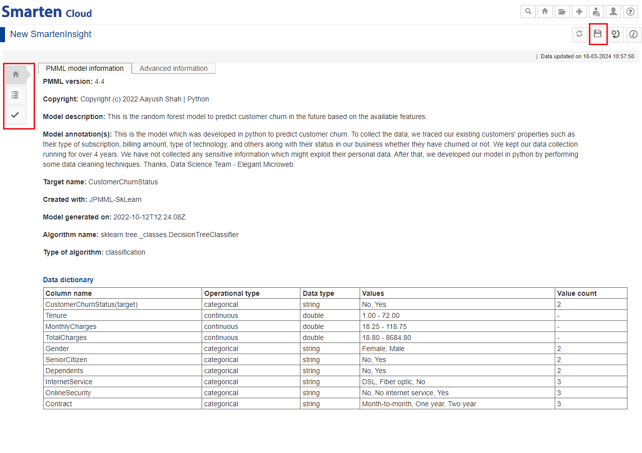
- The system will import the PMML file, validate it, and generate the Smarten Insight model from PMML definition.
PMML MODEL VIEW
- Save the model by clicking the “Save” icon for future use. Share the model with your team by saving it in the “Repository” folder.
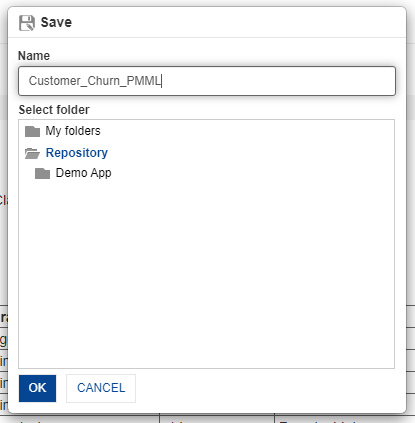
SAVE & SHARE
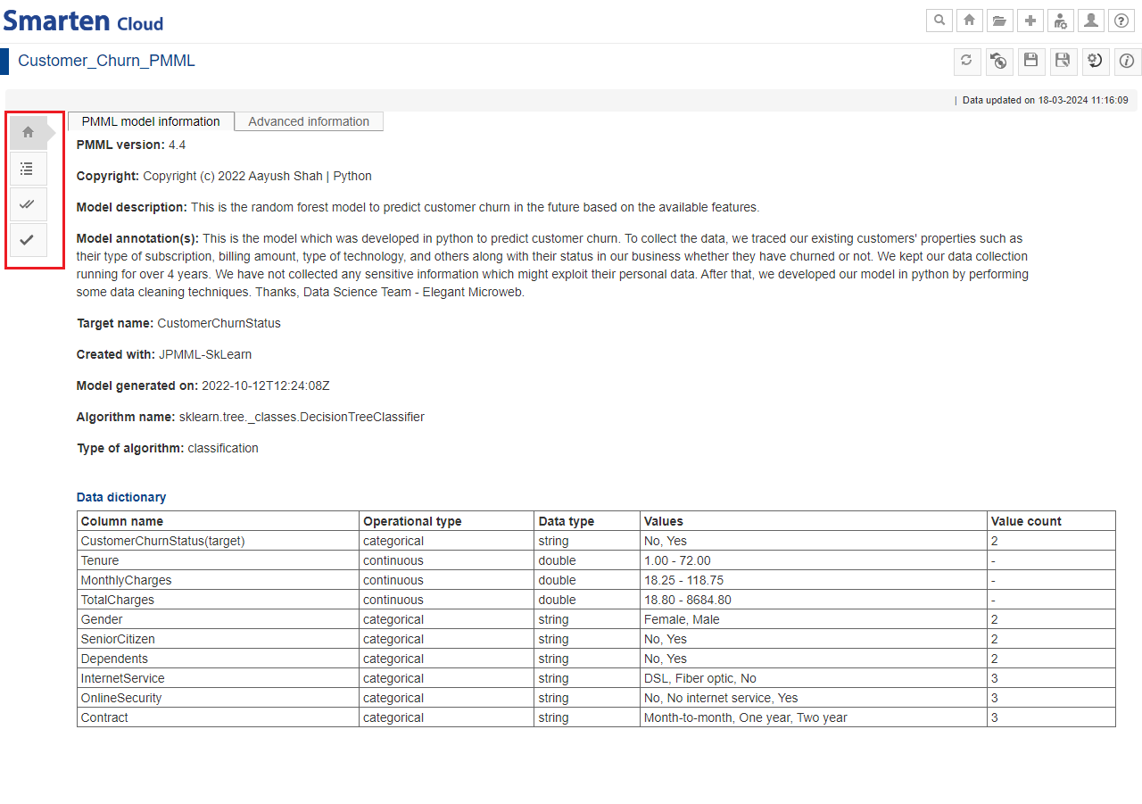
- The model will be loaded in Smarten and show important elements, such as Interpretation, Model Summary, and Model Information.
- You can perform various actions described below using the left toolbar.
PMML model information: You can view the model information, such as algorithm type, created in, data dictionary, and others.
Interpretation: Interpretation provides information about significant predictors and their influence on the target.
Mass apply: You can apply the model to multiple records at a time by uploading a .csv file or selecting a dataset.
Apply model: You can enter values for the input parameters and see the results of the model for a single record.
PMML-SAVED VERSION
11.1. Navigation in PMML
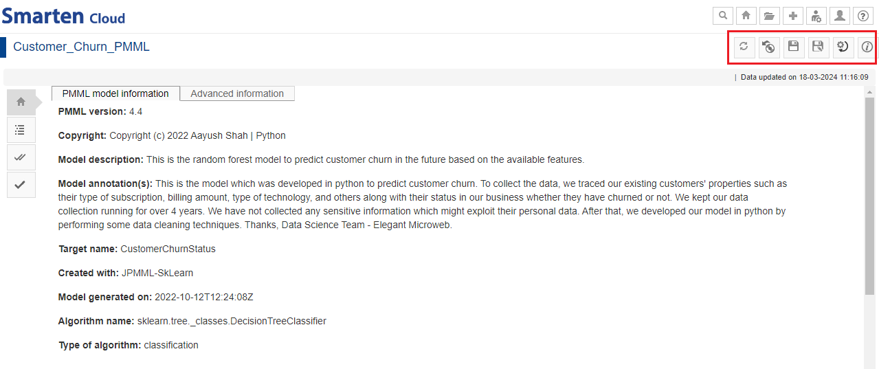
You can perform various operations from the tool bar.
- Toolbar menu: Refresh, Restore, Save, Save As, Change Model Parameters and Object Information.
PMML-TOOL BAR
12. Create a SnapShot
This section will explain how the Smarten SnapShot monitors and captures insights for the anomalies observed in a time series data using the “Sales” dataset that we created earlier.
- Click the option “Consume Data” from the home page.
HOME PAGE
- Click on “Anomaly Alerts” option to create a SnapShot object.
ANOMALY ALERTS
- Select the dataset “Sales Dataset” from the list of datasets, and click “NEXT.”
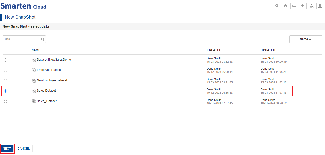
SELECT DATASET
- Select the desired option for “filtering” and then, click “NEXT”.
- Select “No” option to select the entire dataset data without any filters.
- Select “Yes” option to select the filter criteria to filter dataset data.
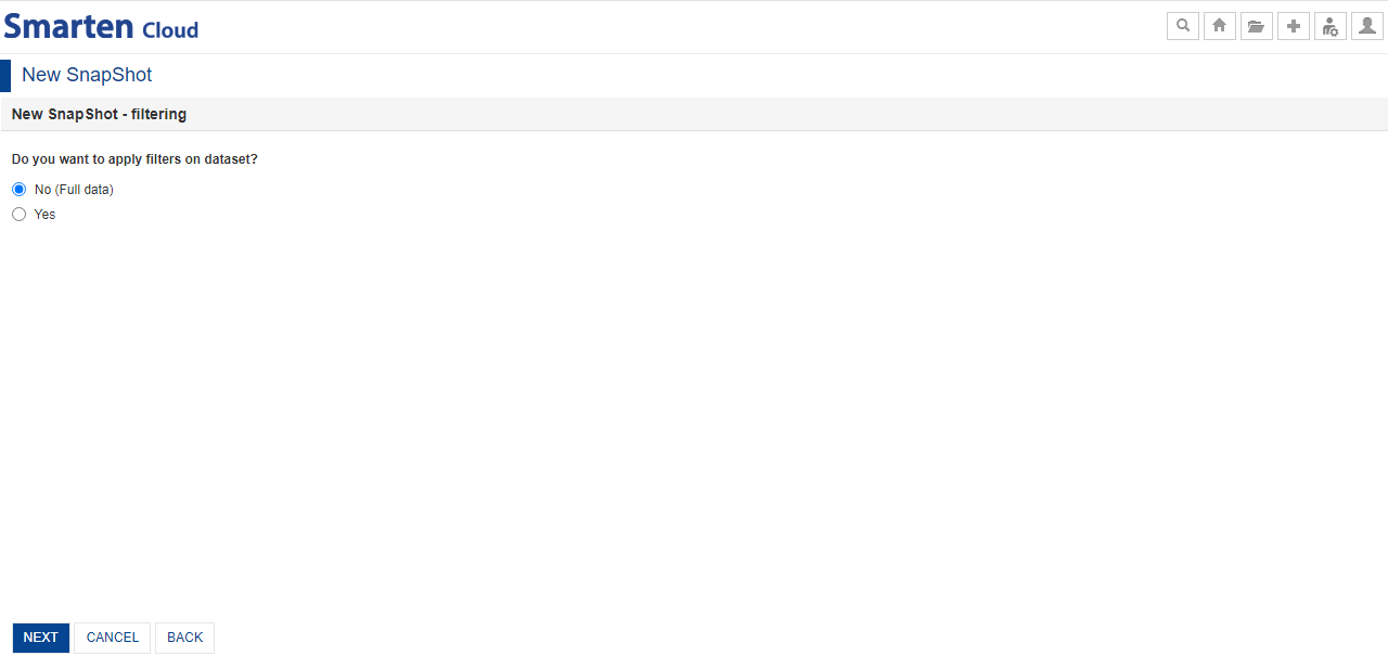
SELECT FILTERING ON DATASET
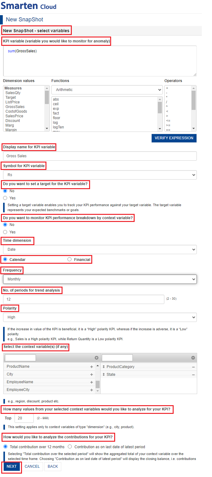
- Select variables to create a SnapShot as per requirement.
- “Select KPI variable” that you would like to monitor for anomaly. You can manually type the “Expression” or select the options from “Dimension Values”, “Functions”, “Operator” drop-down lists to form an expression. Click “VERIFY EXPRESSION” to check the validity of expression.
- Specify the “Display name” and select the “Symbol” for KPI variable.
- You can “monitor the KPI variable against the set target”. You can select the target variable by clicking on “Yes” option; manually type the expression or select the options from “Dimension Values”, “Functions” and “Operator” drop-down lists. Click “VERIFY EXPRESSION” to check the validity of expression. Specify the “Display name for the target variable” accordingly.
- You can select the desired option to “monitor KPI performance breakdown based on context variable”. You can select “Yes” option to create and monitor Snapshot for the selected KPI for multiple values of a context variable in the data.
- Select the “Time dimension”; “Calendar” or “Financial” Year option as per requirement.
- Select the “Frequency” from the drop-down list and specify the “No. of periods for trend analysis”.
- Specify the “Polarity(High/Low)” for the KPI variable based on its nature. For example, ProfitTarget KPI has high polarity, as a higher value is better while Discount target KPI has low polarity, as a lower value is better.
- Select “context variables” based on which you want to further slice and dice your KPI variable and find out the reasons for an anomaly. For example, selecting” State” and “ProductCategory” as context variables will show which states and products contribute the most towards selected KPI variable (for example, GrossSales) and which ones less. This enables a more granular level of analysis.
- Specify “the number of values from your selected context variables” that you would like to analyze for your KPI.
-
Select the desired option for the “timeframe to analyze the contributions” for your KPI.
- “Total contribution over the selected period”, for example, you can create GrossSales SnapShot with monthly frequency and select 12 months as no. of periods to be analyzed.
- “Contribution as on last date of latest period”, for example, closing stock balance.
- Click “NEXT”.
NEW SNAPSHOT-SELECT VARIABLES
-
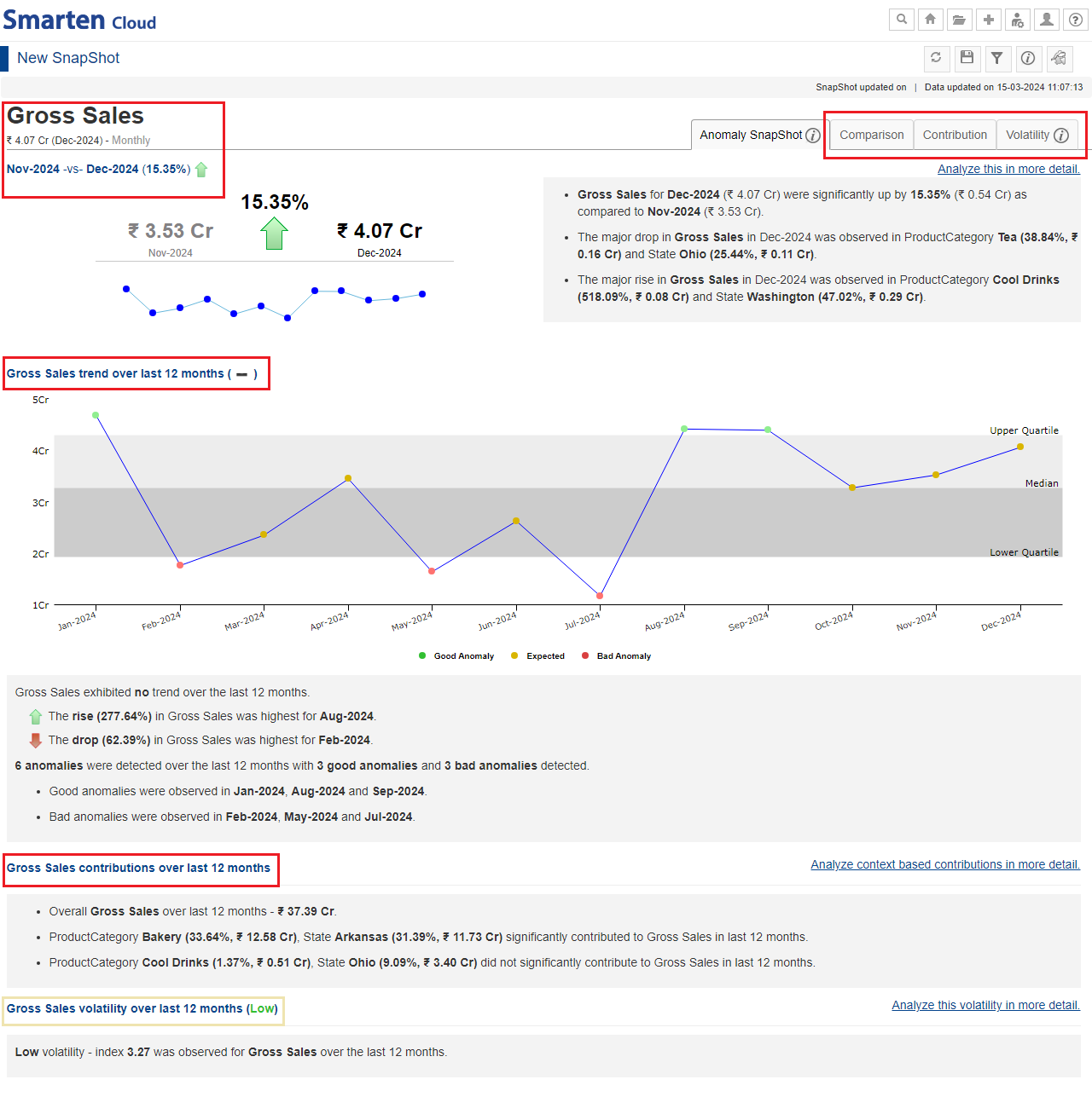
SnapShot without Breakdown: You can create and monitor SnapShot for a selected KPI and analyze that KPI variable performance by performing slice and dice by related context variables in the data, for example,
monitoring GrossSales with monthly frequency and analyzing anomaly insights using State and ProductCategory context variables.
-
SnapShot without target variable: The “Anomaly SnapShot” tab will display the comparative analysis of how the KPI varies over the current and previous time periods, which context variables contribute to
the corresponding variation, an overall trend over a chosen time frame, determines the number of anomalies observed over a period of time, and also shows the holistic view of the significant and non-significant
contributors in the selected time frame, and how volatile the behaviour of the KPI has been.
-
If you want to deep dive into the details, you can click any of the following tabs to analyze the KPI performance.
- “Comparison” tab presents an analysis of current and previous period comparison of the KPI and, context value based comparison and trend.
- “Contribution” tab presents an analysis of the overall contributions made by the context variables toward the KPI for the given timeframe which could be contribution over the selected period or as on the last date of the latest period. It also identifies the significant combinations of context variables that have contributed to the overall outcome.
- “Volatility” tab highlights the volatility index i.e. fluctuations in the KPI performance of the KPI variable for the selected period.
-
If you want to deep dive into the details, you can click any of the following tabs to analyze the KPI performance.
-
SnapShot without target variable: The “Anomaly SnapShot” tab will display the comparative analysis of how the KPI varies over the current and previous time periods, which context variables contribute to
the corresponding variation, an overall trend over a chosen time frame, determines the number of anomalies observed over a period of time, and also shows the holistic view of the significant and non-significant
contributors in the selected time frame, and how volatile the behaviour of the KPI has been.
SNAPSHOT-WITHOUT BREAKDOWN-WITHOUT TARGET VARIABLE
-
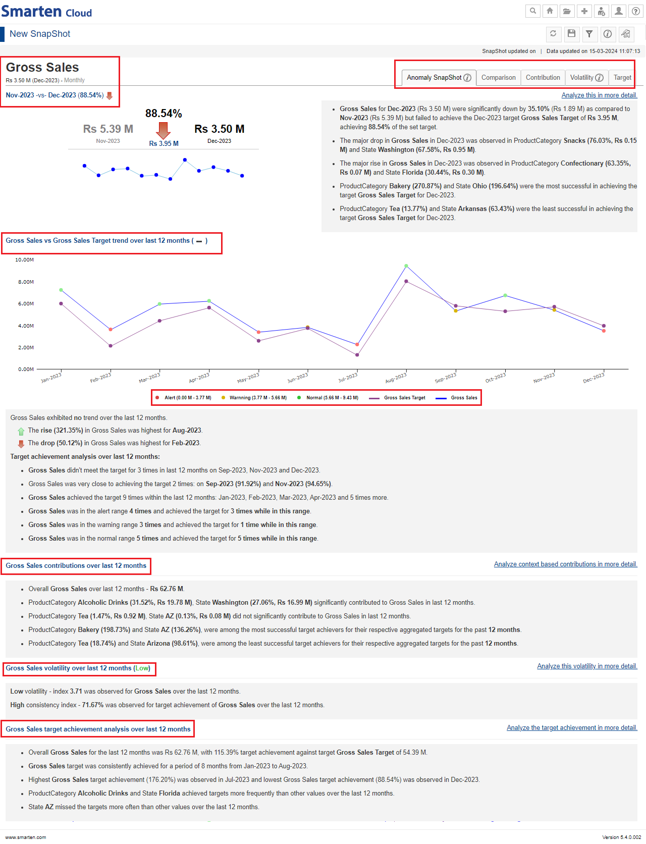
SnapShot with target variable: The “Anomaly SnapShot” tab will display the comparative analysis of how the KPI varies over the current and previous time periods against the set target, which context variables
contribute to the corresponding variation, an overall trend over a chosen time frame with comparison of the KPI and target variable, determines the number of anomalies observed over a period of time with Alert, Warning
and Normal thresholds, the holistic view of the significant and non-significant contributors in the selected time frame, how volatile the behavior of the KPI has been against the set target and, the consistency in
achieving those targets.
-
If you want to deep dive into the details, you can click any of the following tabs to analyze the KPI performance against the set target.
- “Comparison” tab presents an analysis of the KPI performance against the set target.
- “Contribution” tab presents an analysis of the overall contributions made by the context variables toward the KPI for the given timeframe which could be contribution over the selected period or as on the last date of the latest period. It also identifies the significant combinations of context variables that have contributed to the overall outcome.
- “Volatility” tab presents the volatility and consistency index of the KPI variable, context value based variations and its related combinations for the selected period.
- “Target” tab highlights the target achievement analysis along with trend and context value based target analysis.
-
If you want to deep dive into the details, you can click any of the following tabs to analyze the KPI performance against the set target.
SNAPSHOT WITHOUT BREAKDOWN-WITH TARGET VARIABLE
-
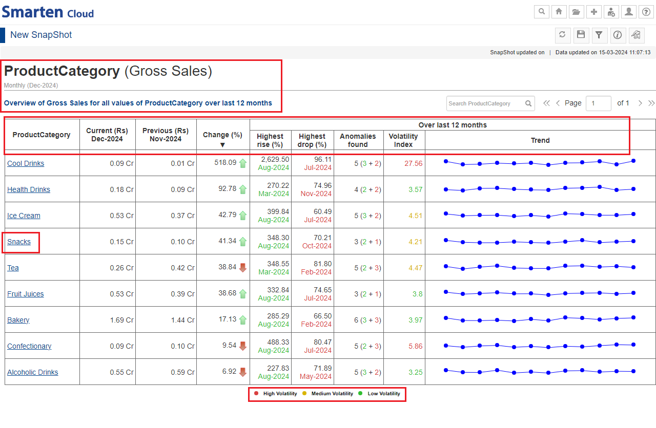
SnapShot with Breakdown: You can create and monitor SnapShot for a selected KPI for multiple values of a context variable in the data. For example, if you want to monitor GrossSales for multiple ProductCategory
variable, you can take GrossSales as a KPI and ProductCategory as a breakdown column. The system monitors anomalies for each Productcategory, e.g., Snacks, Cool Drinks, Bakery and more and generates alerts based on sales
for each ProductCategory.
- SnapShot without target variable: SnapShot overview page provides a brief overview with a tabular presentation of a breakdown of the KPI variable for the selected breakdown context variable. For each context variable value, it provides details about the current period value, the previous period value, change in percentage, along with selected period -highest rises and drops, total anomalies, volatility index, and trends) in an interactive manner. Click on any one the values of selected context variable (for e.g., Snacks) to deep-dive into the overview in terms of current and previous period valuation, anomalies and volatility.
SNAPSHOT WITH BREAKDOWN-WITHOUT TARGET VARIABLE
- SnapShot with target variable: SnapShot overview page provides a brief overview with a tabular presentation of a breakdown of the KPI variable against the set target for the selected breakdown context variable. For each context variable value, it provides details about the current period value and its target, change in target achievement percentage, along with selected period - target achieved counts, consistency index, highest and lowest achievement figures with corresponding time periods, and trends in an interactive manner. Click on any one the values of selected context variable (for e.g., Snacks) to deep-dive into the overview in terms of current and previous period valuation, anomalies and volatility.
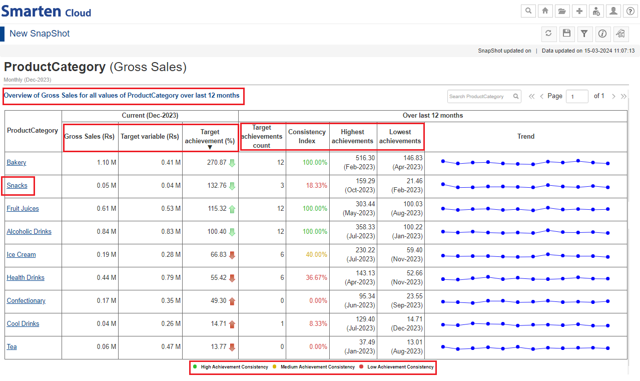
SNAPSHOT WITH BREAKDOWN-WITH TARGET VARIABLE
*Save the SnapShot by clicking the “Save” icon for future use. You can share the object with your team members by saving it in the “Repository” folder.

SAVE SNAPSHOT
12.1. Alerts and Notifications
-
You can configure alerts with desired threshold conditions to be notified when the KPI breaches a given threshold condition. You can receive notifications by email and in-app notifications, and take appropriate action at
the right time.
- Click “Manage alert” icon on the SnapShot tool bar and then, click “Plus” icon to add an alert.
- Specify/select the Alert configurations (Name, Condition, Threshold) as per requirement.
- Select the desired Delivery Method (Delivery mode and Recipients) as per requirement. You will receive the “Notification” in-app and/or email.
- You can edit, delete, hide/unhide the alerts or create new alerts by re-clicking on Manage Alert icon.
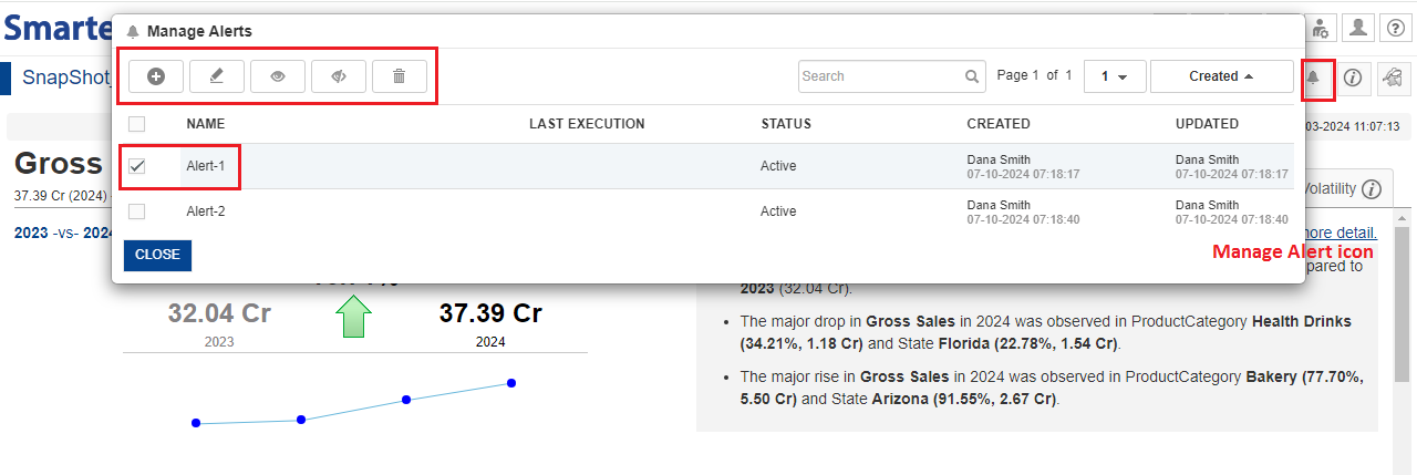
SNAPSHOT-MANAGE ALERT
12.2. Toolbar and Navigation in SnapShot
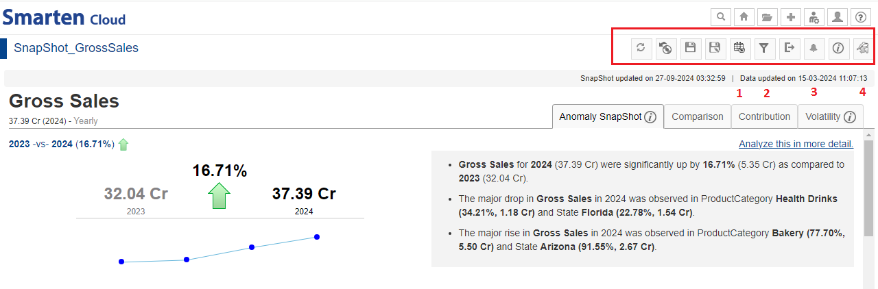
You can perform various operations from the tool bar of the SnapShot screen.
-
The tool bar performs various operations on the SnapShot overview page like Refresh, Restore, Save, Save as, SnapShot refresh configuration, Filters, Export, Manage Alerts, Object Information and SnapShot Properties.
1.SnapShot refresh configuration: Select “Refresh Snapshot on cube/dataset rebuild” to refresh the object immediately when the dataset is updated. Select “Custom” to schedule frequency for task execution.
2.Filters: Select Filter or Expression as per requirement and choose the desired options from the consequent drop-down lists to add filters and click “APPLY”.
3.Manage alert: Use this option to manage or configure alerts with desired threshold conditions to be notified when the KPI breaches a given threshold condition.
4.SnapShot properties: Use this option to change or edit the properties of the SnapShot currently in use.
SNAPSHOT TOOL BAR
13. My Account
- This section provides details about how to manage your account related activities like buy/renew and upgrade plan, add viewers/mobile users, transactions, billing information.
- Click on the “
 ”icon and select the option “My Account”.
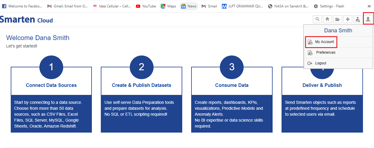
MY ACCOUNT
- “My Account” page gives the details about your subscription and other related information.
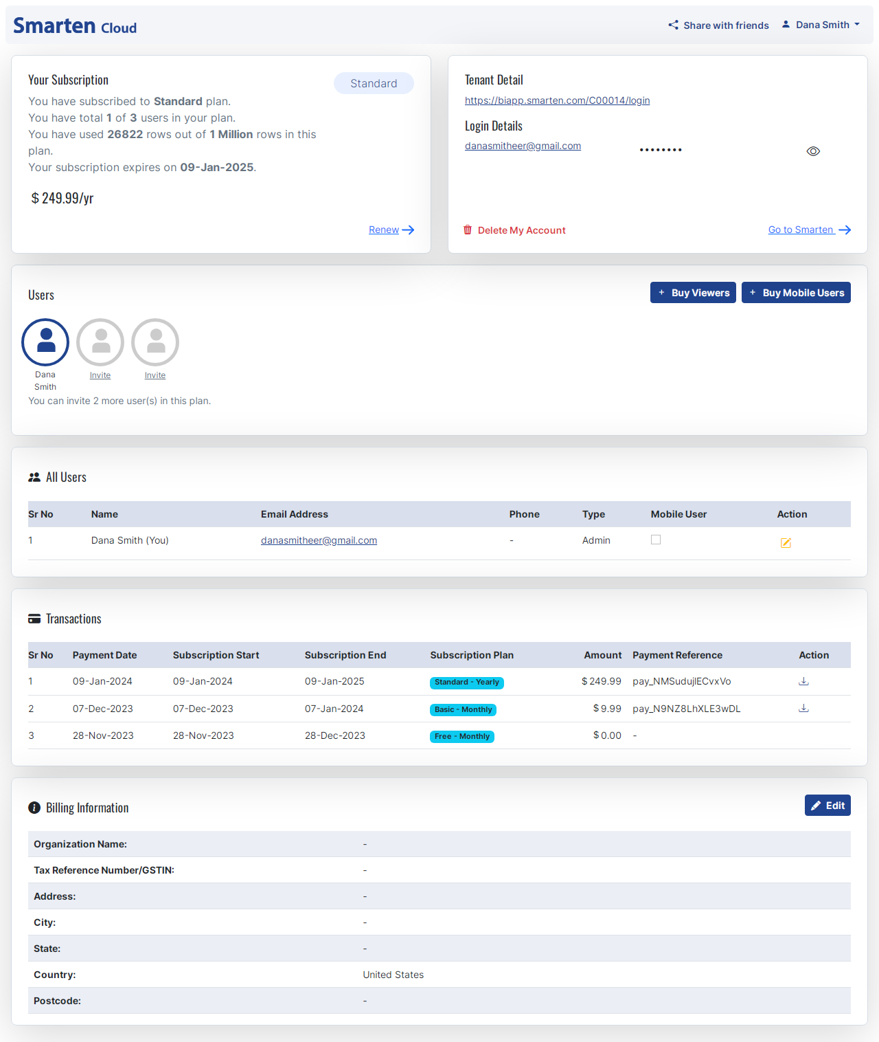
MY ACCOUNT MANAGEMENT
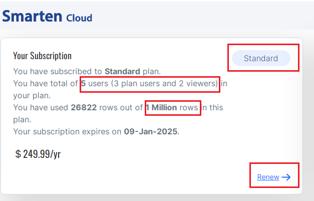
- Your Subscription box displays the details about your SmartenCloud subscription like your current subscription plan, the number of users, the number of rows available and utilized, the subscription expiry date along with the monthly/yearly charge of subscription.
- The current subscription selected is “Standard” plan that allows you to add 2 more users and utilize upto a million rows.
- You can click “Renew and Upgrade plan” to renew or upgrade your current subscription plan.
SUBSCRIPTION
-
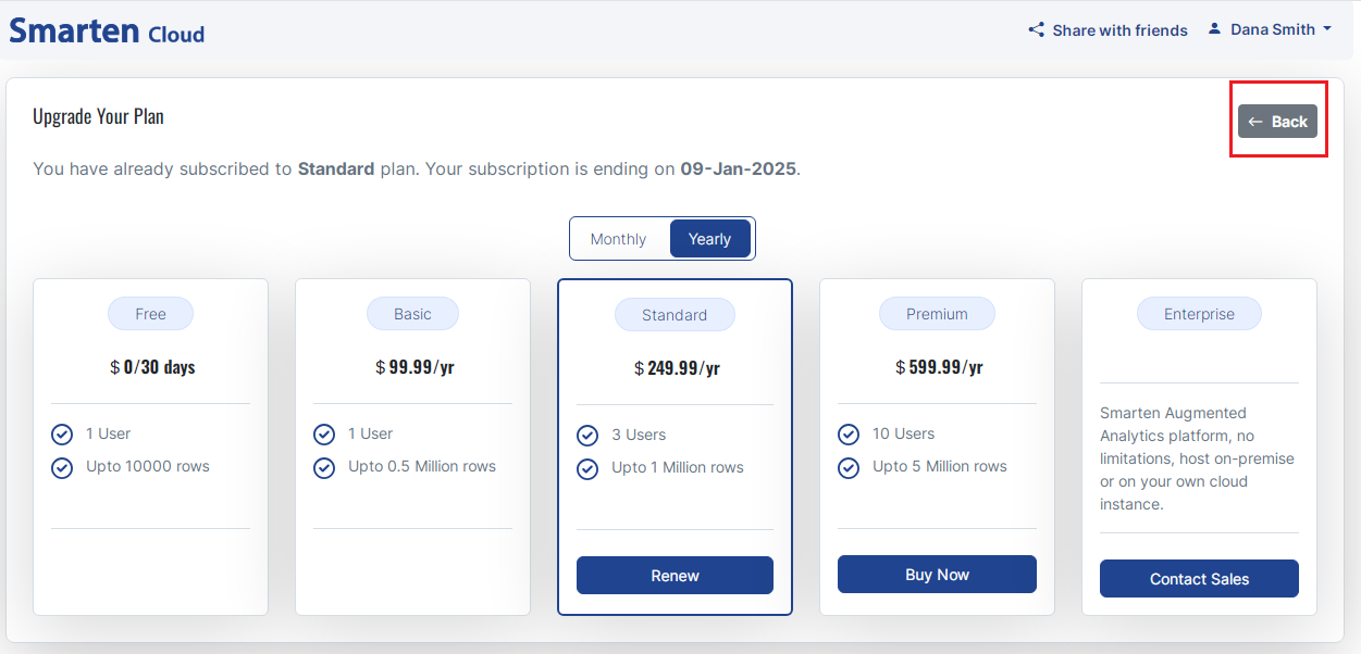
If you decide to “Renew and Upgrade Plan”, SmartenCloud provides different plans and you can select any one as per your requirement.
- Free plan is available for trial purpose to first-time users.
- You can select “Basic” plan that allows you to utilize 0.5 million rows.
- “Standard” plan as mentioned above allows you to add 2 more users and utilize a million rows. Yearly charge is $249.99.
- “Premium” plan allows you to have 10 users, utilize 5 million rows and priced at $599.99/year
- “Enterprise” plan can be customized as per your requirements. You can contact the Smarten Sales team who will facilitate the further course of action.
- You can return to “My Account” page by clicking on “Back” button.
UPGRADE PLAN
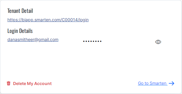
- The Tenant and Main User Details section provides access to password and deletion of your Account. You can change or show/hide the password,
- You can return to SmartenCloud Home page by clicking on “Go to Smarten”.
TENANT DETAILS
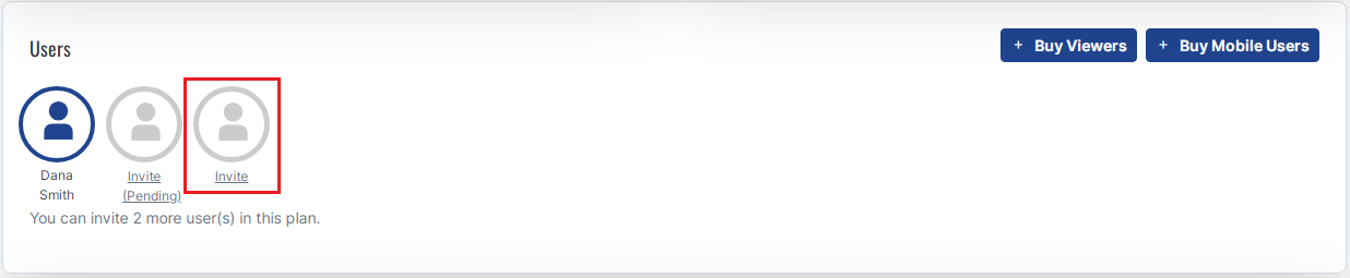
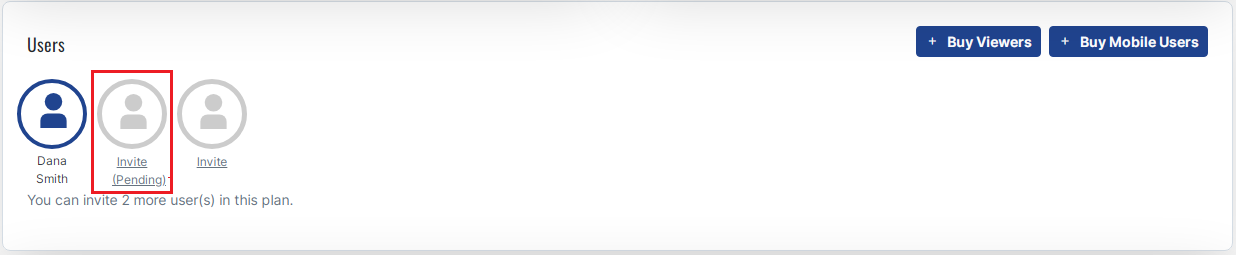
- The “Users” section displays the number of power users of your current plan. Since we have selected “Standard” plan, there are 2 more users provided along with Main user.
- All the users are power users who have access to prepare and make change in the report. However, only Main User has the right to invite rest of the Users. As a Main User, you can invite the user(s) by clicking on the “Invite” icon.
USERS
- The screen will display the “Invite” box. You have to provide the email id of the invited user and click the “Send Invitation” button.
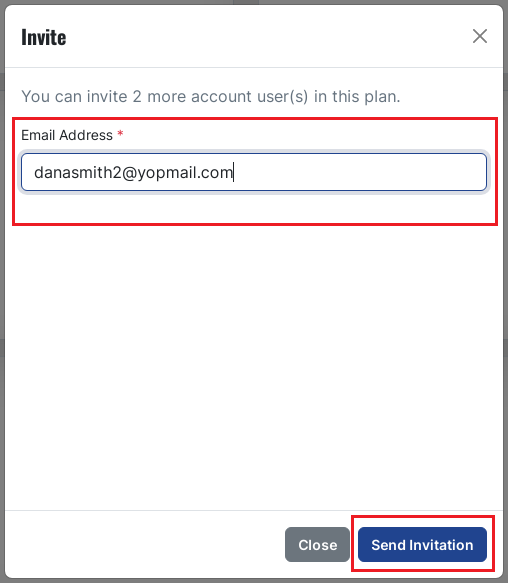
- Here we have already sent an invitation which is pending at the moment. Once the invited user accepts the invitation, it will gain access to use SmartenCloud platform.
USERS-PENDING
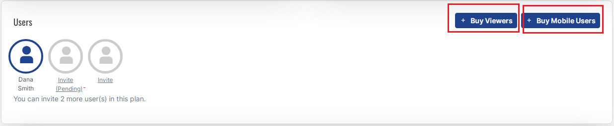
- There are a couple of add-on features like “Buy Viewers” and “Buy Mobile Users” which allows you to add upto 50 such users.
- As a Main User, you can buy Viewers by clicking on “Buy Viewers” button. Once added to your profile, the viewer-user can only view the reports.
- As a Main User, you can also buy Mobile Users by clicking on “Buy Mobile Users” button. You can buy viewer-mobile user after having bought it as the “Viewer”. “Mobile Users” have access or can view the reports on their Mobile app.
BUY VIEWERS-MOBILE USERS
- Let’s buy 4 Viewers for the current plan.
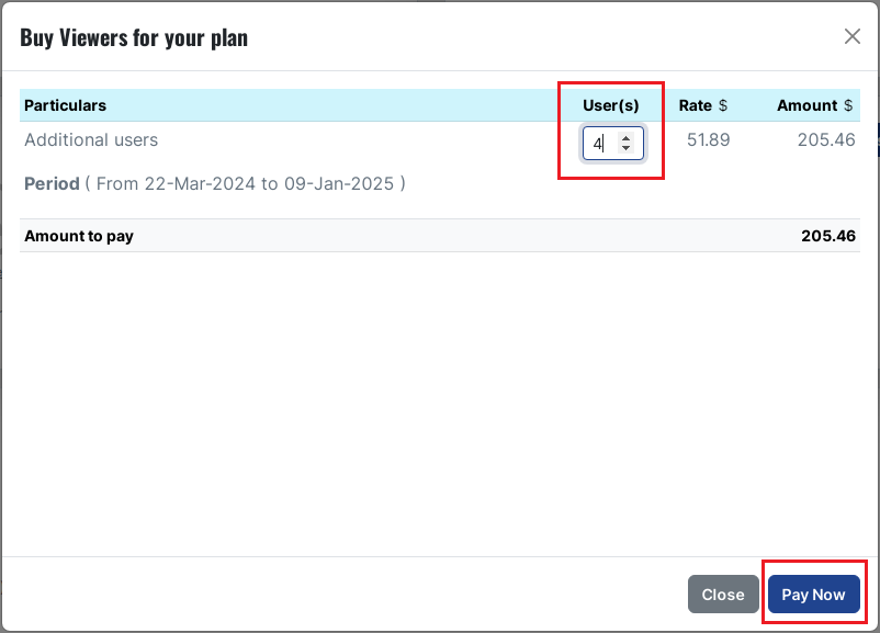
BUY VIEWERS
- You can track your Transactions History in the “Transactions” section.
- Apart from Subscription Duration, Plan and Amount paid till date, you can also download the invoice(s) of the transactions using the “Action” option.
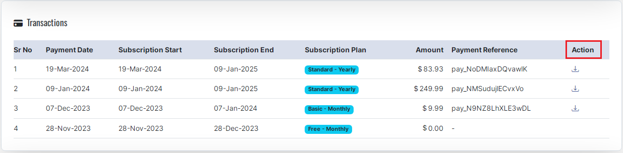
TRANSACTIONS
- The Billing Information section provides billing details. You can click the “Edit” button to fill/edit the contact details at any point of time.
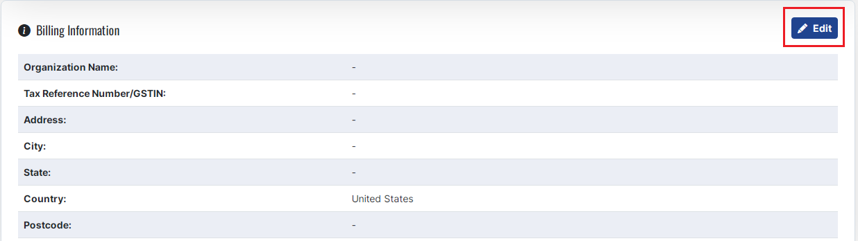
BILLING INFORMATION
- You can fill the required information in the boxes provided in the “Billing Information” form.
- Click the “Save” button to save the details. Click the “Close” button if you don’t want to edit the billing information.
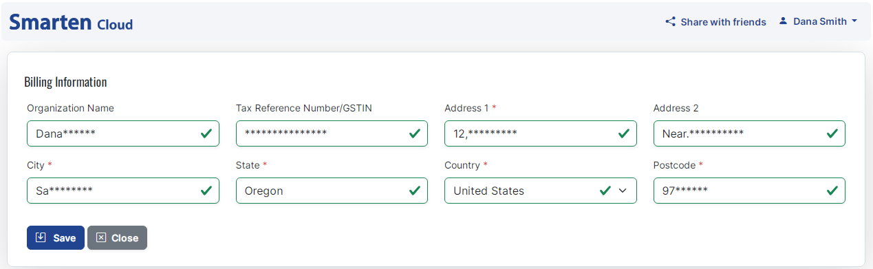
SAVE BILLING INFORMATION
14. Other Navigation Options
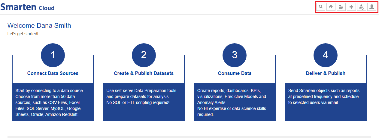
- Navigation menu
The navigation menu gives the options below.
|
Action |
Description |
|
|
Search using Clickless Analytics |
|
|
Go to Home page from any page. |
|
|
Open Model, My Folder, Repository, and Datasets. |
|
|
Create new Dataset, Autoinsights, Assisted Predictive Model, and Import PMML file. |
|
|
Configure with Image Library and Geo map |
|
|
Go to My Account and Logout. |
NAVIGATION MENU OPTIONS
HOME PAGE—NAVIGATION MENU
-
Recent, My favourites, My folder, Repository, and Datasets tabs
You can quickly search and open the models and datasets from these tabs.
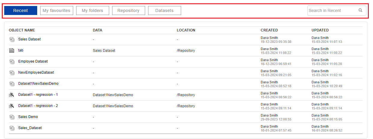
HOME PAGE—RECENTLY USED OBJECTS AND DATASETS
-
Use case examples
Open, explore, and learn about the possibilities with demo and use case libraries provided in this section.
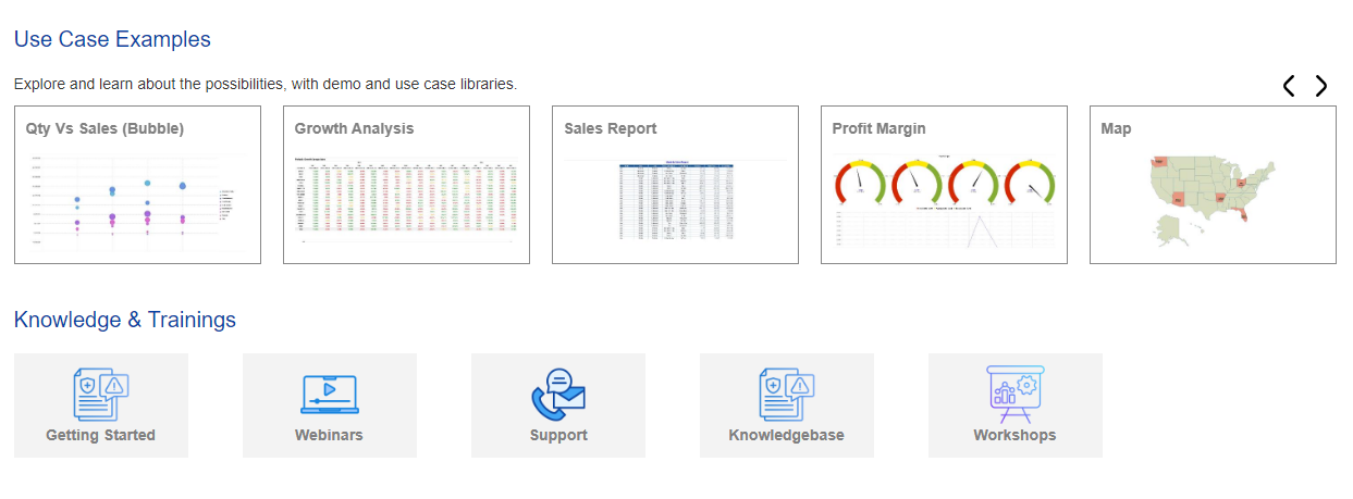
DEMOS & USE CASES
Copyright © 2025 Elegant Microweb Technologies Pvt Ltd